Using Information Models
Exosite's information model design allows you to upload product model settings to the cloud and make changes to your app's UI without writing any code or rebuilding the app. Using information models, you can configure your product's UI components and set up integration services like Alexa and Google Home.
Process of Loading Corresponding Information Model
Mobile app will run from the first rule to the final rule to see which is the corresponding information model.
- The device model name is the same as familyName of the information model.
- The device model name matches the familyMembers of the information model.
- Custom rules if there is any. The custom rules will be in
src/modules/information-model/custom/model-dispatch-helper.ts.
Note
- If the prior rule is matched, mobile app won't check the next rule.
- If all the rules are not matched, there will be no device UI shown on mobile app.
- For integration schema, ExoHome will only check whether device model name matches the familyMembers of the information model or not at this time.
Create Your Own Information Models
To get started, we already provided some example information models under the folder/src/assets/models/.
Information models are loaded from this folder, as well as from the Admin site's "Information Model" tab, with the most recent version being cached.
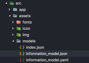
Index.json
The "index.json" is used to tell which local files to load. Note, this does not apply to any files uploaded to your Admin site.
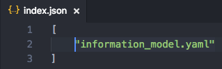
JSON or YAML
Currently, we support 2 formats, JSON and YAML. You can choose the one you are more familiar with to create your own model. App can load files in different formats at the same time.
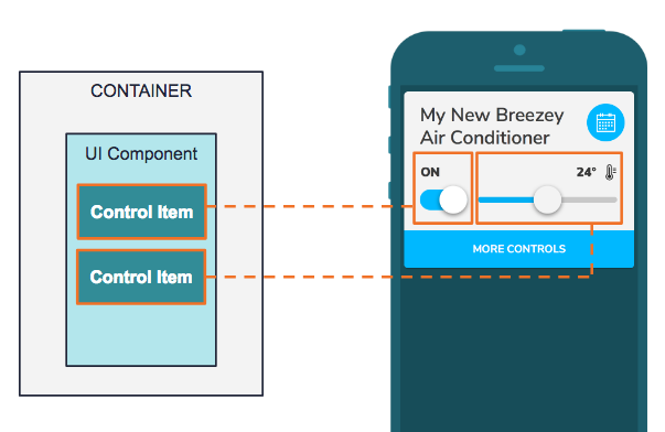
Container Model
A container represents a "popit." A “popit” is a compact, feature focused interface for device activities and actions. You can click “More Controls” to expand the interface. The scope for this container includes the entire interface for a device.
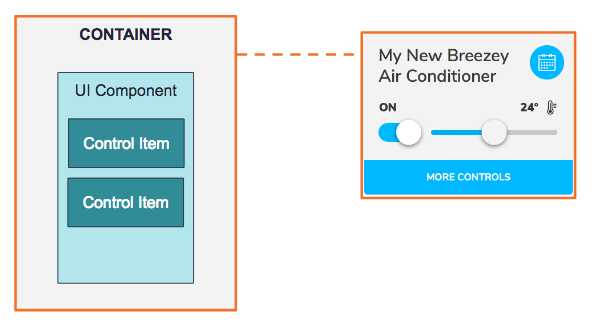
The primary goals for the container model are:
- Describing the layout for UI components.
- Defining the supported devices in this family.
Here is some sample code.
familyName: EXAMPLE DEVICE
familyMembers:
  - DEVICE MODEL ID
  - "EXO.*"
controlLayout:
  primary:
  - UI_Component_1
  - UI_Component_2
  secondary:
  - UI_Component_3
scheduleLayout:
  primary:
  - UI_Component_1
  - UI_Component_2
  - UI_Component_3
chartLayout:
  main:
    - MY_CHART_1
chartComponents:
  MY_CHART_1:
    type: line-chart
    title: INFORMATION_MODEL.TEMPERATURE
    models:
    - key: H03
      values:
        min: 16
        max: 32
        step: 1
        func: tempCelsius
hiddenFields:
- H28
errorFields:
...
deviceId: 1
components:
  UI_Component_1:
  UI_Component_2:
  UI_Component_3:
integration:
  traits:
    ...
Family Name
Field: familyName
Definition: Name of individual config files.
The name should be unique to the config files in the App. If there are duplicate names, the later config file will overwrite the previous one.
Note
This is the first rule mobile app will check for the corresponding information model.
Family Members
Field: familyMembers
Definition: Supported devices under this family.
This field is used to define the supported device models for the config file. It supports string or regular expression.
Control Layout
Field: controlLayout
Definition: Layout of the Control Items in the Device UI.
This field is used define the order of the control items in the control layouts which are primary and secondary layouts. The controls items will display based on the order defined here.
Schedule Layout
Field: scheduleLayout
Definition: Layout of the Control Items in the Schedule page.
This field is used to define the order of the control items in the schedule view which are primary and secondary layouts. The controls items will display based on the order defined here.
Schedule function might not be applicable for certain devices, such as washing machine, so you may leave this field blank to hide the schedule icon.
Note
Remove schedule icon can only be applied to the following layout style: Popit List and Popit List with Image.
Chart Layout
Field: chartLayout
Definition: Layout of the chart items in the device history page
This field is used to define the order of the chart items in the history page. The order of device properties will be shown as defined here.
The main section is required in the chartLayout. For example:
chartLayout:
  main:
    - MY_CHART_1
    - MY_CHART_2
Device ID
Field: deviceId
Definition: Device ID
The value of this field is based on the type of Home Appliance. If AC is defined as 1, all devices with Device ID equals to 1 will be viewed as AC.
Hidden Fields (Optional)
Field: hiddenFields
Definition: List of hidden control items
If a field is used for the data collection or troubleshooting with no need to display the information on the UI, those can be listed under this field so that they will be loaded by the APP but will not be shown on the UI. For example, H28 is a field for power usage data which should be sent by the module to cloud but should not be shown on the UI, it can be list under this field.
Error Fields (Optional)
Field: errorFields (Optional)
Definition: List of fields that carry error information
The errorFields is used for error reports to indicate which fields are carrying errors and will be shown on admin site as error logs.
Error Example
  "errorFields": [
    {
      "key": "H29",
      "values": [
        {
          "value": 13,
          "text": "WATER TEMPERATURE TOO HIGH"
        },
        {
          "value": 85,
          "text": "ERROR IN VFD"
        }
      ]
    }
  ]
Note
RangeandRulesare not supported in ErrorFields.- It will be shown as error logs on the admin site.
Component Repository
Field: components
Definition: Component repository
All available UI components candidates and its related information are stored in the component repository as key-value pair. The same key in this key-value pair is used to define what UI component to use in “controlLayout” or “scheduleLayout”.
UI Component Model
Under the container, there can be many UI components. The highlighted box on the right indicates a UI component on the primary layout.
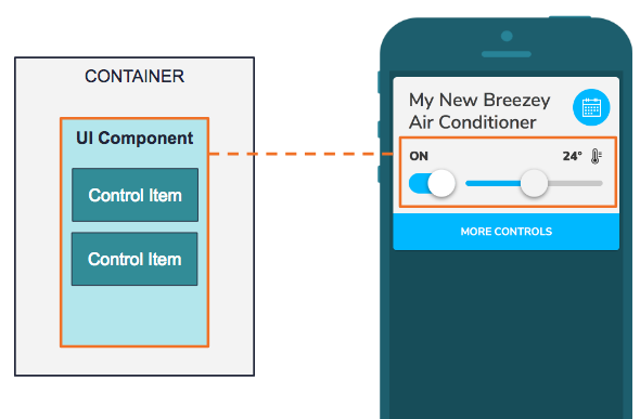
The App will load the UI component based on the type provided in this model and render UI of control items accordingly.
Here is some sample code.
components:
  UI_Component_1:
    type: button-group
    title: POWER
    models:
    - key: H00
      values:
      - value: 0
        text: 'OFF'
      - value: 1
        text: 'ON'
  Other_Component:
HideFromGroup (Optional)
Field: hideFromGroup
Definition: Set true if you want to hide this component from the group control. If you set the value as false, the result would be the same as without this property.
For example:
UI_Component_example:
  hideFromGroup: true
  type: range-with-toggle
  title: Example
  models:
  ...
Type
Field: type
Definition: UI component types
See below for the UI components provided in the current version. User can add their own customized UI components.
R (read only): Allow user to read status data only R+W (read and write): Allow user to read status data and control it.
- button-group (R+W)
- range (R+W)
- text (R)
- toggle (R+W)
- range-with-toggle (R+W) Order of control items in the definition:
- Range
- Toggle
- large-toggle-with-range (R+W) Order of control items in the definition:
- Range
- Toggle
- button-group-with-toggle (R+W) Order of control items in the definition:
- Button group
- Toggle
Title
Field: title (Optional)
Definition: Title to be displayed
Models
Field: models
Definition: Models for Control Items
It may contain one or more control items. For example, “range-with-toggle”, it includes two set of data, one is for range and another is for toggle.
UI_Component_example:
  type: range-with-toggle
  title: Example
  models:
  - key: H00
    values:
    - value: 5
      text: Item #1
    - value: 4
      text: Item #2
    - value: 3
      text: Item #3
    - value: 2
      text: Item #4
    - value: 1
      text: Item #5
  - key: H00
    values:
    - value: "*"
    - value: 0
      text: AUTO
    default: 3
Chart Component Model
The history page under a device displays historical data for users. You can set which device properties are displayed and customize each charts display using the settings below.
Here is some sample code.
chartComponents:
  MY_CHART_1:
   type: line-chart
   title: Temperature
   models:
   - key: H03
      values:
        min: 16
        max: 32
        step: 1
        func: tempCelsius
  MY_CHART_2:
    ...
Type
Field: type
Definition: The type of chart component used
Currently one chart type is provided in the current version.
- line-chart
Title
Field: title
Definition: The title text displayed in the tab
Models
Field: models
Definition: The models for the chart
This contains one control item. The definition between chart component and UI component is the same, but under chart component disable rules and dependency rules won't affect anything.
SpecIal Use Case for TaiSEIA Service ID - H28 (accumulated power consumption)
type: line-chart and bar-chart are both supported
func: accumulatedElectricity
chartComponents:
  HISTORICAL_CHART:
    type: bar-chart
    models:
    - key: H28
      values:
        func: accumulatedElectricity
        max: 10
        min: 0
        step: 1
    title: INFORMATION_MODEL.ELECTRICITY
Control Item Model
A control item is a minimum unit to define how real device data is being connected and controlled, as well as showing dependency based on other information of the same device. There might be one or more control items in the UI component. The example below is a compound component called Range with Toggle. You can define the text shown on the component, the image as well as the value you send when user slides on the range bar or switch the toggle. It will also display the device state based on this information.
Key
Field: key
Definition: The field the control item interacts with.
Define which field on the ESH table the control item should read the data from and/or send the value to. For example, for ACs (Device ID=1), H01 for is “AC mode”.
Note
For SAANET devices, "key" values must use a capital H to work properly.
Values
Field: values
We provide two ways to define values currently: listing and range. See below:
LISTING
values:
  - value: 0
    text: "ON"
  - value: 1
    text: "OFF"
RANGE
(1) Using predefined function
values:
  min: 16
  max: 32
  step: 1
  func: "tempCelsius"
OR
(2) Using rules
values:
  min: 16
  max: 32
  step: 1
  rules:
  - conditions:
    - key: H00
      op: gte
      target: 16
    - key: H00
      op: lt
      target: 24
    result:
      text: cool
  - conditions:
    - key: H00
      op: gte
      target: 24
    - key: H00
      op: lt
      target: 32
    result:
      text: normal
When the device data should be calculated and processed before shown on the UI, it is suggested to use a predefined function (1) . When the device data needs to be interpreted based on certain conditions, it is suggested to use rules (2). When predefined function and rules exist at the same time, predefined function takes the priority.
Default
Field: default
Definition: default setting of a control item
When using the “*” symbol in the value field, it means “*” can be any value. In this case, a default value should be assigned, and this value will be sent when user controls this component. For example, when H00 equals to 0, it will show “AUTO”. On the other hand, when H00 equals to any value except for 0, it won’t show anything on display and send default value, 3 in this case.
UI_Component_example:
  type: toggle
  title: Example
  models:
  - key: H00
    values:
    - value: "*"
    - value: 0
      text: AUTO
    default: 3
Dependency Rules
Field: dependency (optional)
Definition: rules to describe the interdependent relationship between different keys
The dependency rules are used when the control options of the device needs to be changed based on other device data. For example, the dependency rule can be used if the options of the fan speed in an AC changes based on the AC mode.
AC_FAN_SPEED:
  type: range-with-toggle
  title: FAN SPEED
  models:
  - key: H02
    values:
    - value: 0
      text: AUTO
    - value: 4
      text: HIGH
    - value: 3
      text: LOW
    - value: 2
      text: WEAK
    - value: 1
      text: SILENT
    dependency:
    - conditions:
      - key: H01
        op: eq
        target: 1
      result:
        values:
        - value: 0
          text: AUTO
        - value: 4
          text: HIGH
        - value: 3
          text: LOW
    - conditions:
      - key: H01
        op: eq
        target: 3
      result:
        values:
        - value: 0
          text: AUTO
        - value: 1
          text: SILENT
        - value: 2
          text: WEAK
In the above example, H01 means AC Mode and H02 means Fan Speed. It shows how a dependency between different device states are set up. For example, When AC mode equals to 1, you will display AUTO, High and Low as options under the fan speed.
Disable Rules
Field: disable (Optional)
Definition: the rule of disabling setting
If the control items will be limited because of other status data, you can use this rule to adjust the control items. For example, AC’s power setting will determine whether user can set other control items, so you can add disable rule for this condition.
AC_TIMER:
  type: range
  title: TIMER
  models:
  - key: H06
    values:
      min: 0
      max: 1440
      step: 60
      func: timer
    disable:
    - conditions:
      - key: H00
        op: eq
        target: 0
H00 means the AC’s power setting and H06 means the timer setting.
Rule and Concept
Rules and Conditions is an essential part of the information model. It is used to describe the dependency between device properties/fields and to define disable states and controls the values in the control items. The section below describe how they can be applied.
Rule
Each rule equals to a “If...then” expression, so each rule includes one or more conditions and one or no result. When combining multiple rules, it could be something like the descriptions below:
IF condition1 AND condition2 THEN result1 // RULE 1
ELSE IF condition3 AND condition4 THEN result2 // RULE 2
... other rules ...
In order to simplify the complexity of this model, it will only return the result when all conditions in a rule are true. In other words, each condition is connected by “AND.” If there are “OR” conditions, it will be viewed as two different rules, for example:
IF condition1 OR condition2 THEN result1
equals to
IF condition1 THEN result1
ELSE IF condition2 THEN result1
Condition
There are 3 properties under a condition:
- Key
- Operation
- Target
Key
Field: key Definition: the field in the ESH table that the condition refers to.
Indicates a specific field on a device, i.e. H00, H01...etc. The parser of the app will take this key as a reference value to determine whether a condition is true.
conditions:
- key: "*"
  op: eq
  target: 0
equals to
conditions:
- key: H00
  op: eq
  target: 0
Operation
Currently the supported operators are listed below:
- "eq" - equal to
- "neq" - not equal to
- "lt" - less than
- "lte" - less than or equal to
- "gt" - greater than
- "gte" - greater than or equal to
Target
The target value that is being compared: integer (e.g. 1000, -2, +3, 0)
Result returned in values
When result is returned in values, it means the status needs to returned to the UI, and the definition of the returned data would be:
- text: item#1
  icon: state-icon
If you want to replace the content to the data from device, you can use __value__.
- text: __value__
  icon: state-icon
Below is a complete example. When the temperature range is between 16 and 32. It will show the temperature data from the device, like 25.
values:
  min: 16
  max: 32
  step: 1
  rules:
  - conditions:
    - key: "*"
      op: gte
      target: 16
    - key: "*"
      op: lte
      target: 32
    result:
      text: __value__°C
Result returned in dependency
When response is returned in dependency, it means a new definition of values should be returned, for example:
dependency:
- conditions:
  - key: H01
    op: eq
    target: 1
  result:
    values:
    - value: 0
      text: AUTO
    - value: 4
      text: HIGH
    - value: 3
      text: LOW
- conditions:
  - key: H01
    op: eq
    target: 3
  result:
    values:
    - value: 0
      text: AUTO
    - value: 1
      text: SILENT
    - value: 2
      text: WEAK
Assuming H01 equals to AC mode and the options in Fan speed varies based on which AC mode a user is at. In this case, a dependency is used to handle this logic.
- If AC mode equals to 1, then the fan speed options will be “AUTO,HIGH, LOW”.
- If AC mode equals to 3, then the fan speed options will be “AUTO, SILENT, WEAK”.
- If AC mode equals none of the above conditions, then the fan speed options will display the default options.
Result returned in disable
When response is returned in disable , in this case, it will only return boolean, so no result is needed. For example:
disable:
- conditions:
  - key: H00
    op: eq
    target: 0
Custom Information Model Module (Advanced)
If you want to do advanced setting, you can go to/src/modules/information-model/ where we put the module.
Here you will find the two folders named"custom" and “logics”. The content under “custom” folder is mainly to enhance creating and selecting the information model. On the other hand, the content under “logics” folder is mainly to provide the predefined logics for UI components, in order to increase the efficiency of developing custom UI components.
Custom Folder
This folder includes two items-"predefined functions" and “model dispatch helper”.
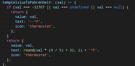
- Predefined Functions
If the device requires some special numerical conversion (e.g. temperature degree conversion), you can add new formula using the "predefined function". Here is a temperature conversion example from Celsius to Fahrenheit.
- Model Dispatch Helper
If the selection of information model does not only depend on the "model name" of the device, but also other information from the device, you could place the processing logic under “model dispatch helper”.
This function should return the "name" of the model, if the responded value is not an empty string, undefined or null, the app will take the name of this model as default setting.
Logic Folder
Under the information model module, we have separated the common binding logics from UI as independent logic component, to simplify the complexity of binding UI component and model.
The main purpose of the separation is to allow developers to reutilize the logic components from here while developing custom UI components, in order to focus on UI layout and design.
Here are four binding logics available:
- Button Group Logic
- Range Logic
- Toggle Logic
- Read Only Logic
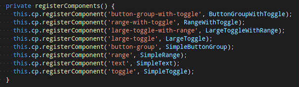
Register a New UI Component
When developer finished a new UI component development, you can register a new UI component from/src/app/app.components.ts. The registered name will be used in this information model.
Additional Tips
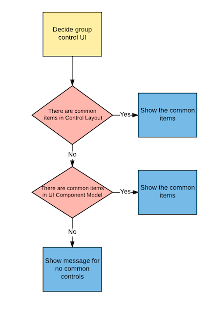
Group Control UI Display Principle
App only shows the common items shared by all devices / information models in the same group. The process and logics are handled by App as below.
- Screen all information models for the devices in the same group, compare the UI components in the Control Layout. If there are common items, App will show the common items in the Group Control UI.
- If no common items are found in the Control Layout, it will then compare one level up in the UI component Model. If there are common items, App will show the common items in the Group Control UI.
- If no common items are found in both Control Layout and UI component Model, App will show a message saying that no common controls can be found for this group.
Integration Schema (Optional)
This section is for third-party service integration. You can add this section to the information model of your device when you want to set up integration services like Alexa, Google Home, IFTTT, and SmartThings actions.
Traits
Field: traits
Definition: Traits are the top-level element in the integration schema.
Traits allow individual devices to be represented as multiple independent devices towards integrations. This is often helpful for Alexa and Google Home when your device supports more switches and controls than a single Alexa Skill supports. For example, when creating a SmartPlug with more than one controllable outlet, it makes sense to create one trait for each of the independent outlets so that each outlet can be controlled using the user's voice via Google Home or Alexa.
Type
Field: type
Definition: Each trait belongs to exactly one type.
The type we supports currently.
- ac
- light
- switch (on/off only)
- smartplug (single outlet) (on/off only)
- fan
- dehumidifier (Google Home only)
- airpurifier (Google Home only)
Here are examples for different types.
Light with percentage example
integration:
  traits:
  - id: 1
    type: light
    description: Smart Light
    attributes:
      on_off:
        key: H00
        values:
          on: 0
          off: 1

      percentage:
        key: H07
        min: 1
        max: 100
        before:
          key: H00
          value: 1
Smart Plug Example With three independent Outlets
integration:
  traits:
  - id: 1
    type: smartplug
    append_name: " 1"
    description: Outlet 1
    attributes:
      on_off:
        key: H00
        values:
          on: 0
          off: 1

  - id: 2
    type: smartplug
    append_name: " 2"
    description: Outlet 2
    attributes:
      on_off:
        key: H10
        values:
          on: 0
          off: 1

  - id: 3
    type: smartplug
    append_name: " 3"
    description: Outlet 3
    attributes:
      on_off:
        key: H20
        values:
          on: 0
          off: 1
ID
Field: id
Definition: ID should be string and needs to be unique.
Append Name
Field: append_name
Definition: Append_name is used to construct a display name for the trait in the integrations. For example when the original device name is "Living Room Plug" then there will be in above examples three devices visible in Alexa and Google Home with the names "Living Room Plug 1", "Living Room Plug 2", "Living Room Plug 3"
Note
The append name is suggested to be different from the type name. If the names of append name and type are the same, all the devices with the same name will be be controlled by external service.
Applied Domain (Optional)
Field: appliedDomain
This field is used to define the integration services that trait applies to. If "appliedDomain" is not provided, the trait will apply to all integration services.
Currently the supported integration services are listed below. Please make sure to use the proper term.
| Integrations | Term |
|---|---|
| Amazon Alexa | alexa |
| Google Home | googlehome |
| IFTTT | ifttt |
| SmartThings | smartthings |
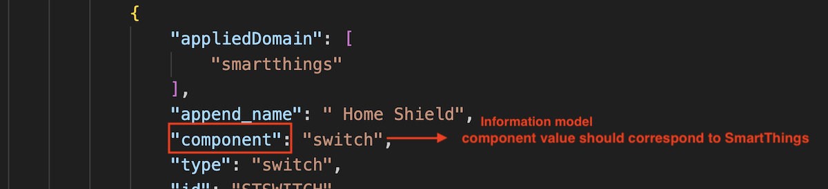
Component (Optional)
Field: component
Definition: Component is used for custom SmartThings device profile capabilities when the profile includes multiple fans, lights, or switch capabilities. The key value must align with the corresponding component names in the device profile. If the device profile contains only a single fan, a single light, or a fan with a light, this field is not required. 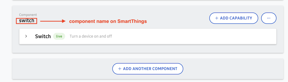
Description (Optional)
Field: description
Definition: This can be used for longer descriptions of the trait inside the integration. It would be displayed in detail views within the Google Home or Alexa application.
Attributes
Field: attributes
Definition: This describes the mapping of known integration semantics to the device keys. A list of all known integration semantics that can be used follows:
| Device | ||||||
| Alexa Skills (field name) | Light | Switch | Smartplug | Thermostat | Smartlock | Fan |
| on_off | v | v | v | v | v | v |
| color_temperature | v | |||||
| brightness | v | |||||
| percentage | v | v | v | |||
| temperature_setting | v | |||||
| alexa_toggles | v | v | ||||
| alexa_modes | v | v | ||||
| fan_speed | v | |||||
| Device | |||||||||
| Google Traits (field name) | Light | Switch | Smartplug | Thermostat | Smartlock | Fan | AC | Air Purifier | Dehumidifier |
| on_off | v | v | v | v | v | v | v | v | v |
| color_temperature | v | ||||||||
| brightness | v | ||||||||
| percentage | v | v | |||||||
| temperature_setting | v | v | |||||||
| toggles | v | v | v | ||||||
| modes | v | v | v | v | v | ||||
| fan_speed | v | v | v | v | |||||
| Device | |||
| SmartThings (field name) | Light | Fan | |
| on_off | v | v | |
| percentage | v | fan_speed | v |
Each attribute can additionally define the before attribute (see examples below). The before attribute will ensure that certain dependencies are triggered before the control acts.
On/Off
Field: on_off
This controls basic on/off on a device. Every device should have this control.
on_off:
  key: H00
  values:
    on: 1
    off: 0
Percentage
Field: percentage
Value is a percentage from 0 to 100 usually and can be used to control the power or speed of smart devices. It also has min and max subfields to define the range (e.g. limit max: below 100%).
Note
Because Google Home does not have explicit percentage we are mapping it to brightness.
percentage:
  before:
  - key: H00
    value: 1
  key: H0F
  max: 100
  min: 1
Brightness
Field: brightness
Value is a percentage from 0 to 100 usually and can be used to control the light brightness. It also has min and max subfields to define the range (e.g. limit max: below 100%).
brightness:
  before:
  - key: H00
    value: 1
  key: H0C
  max: 100
  min: 1
Fan Speed
Field: fan_speed
There are several subfields that support setting the speed of a fan, that is, blowing air from the device at various levels, with settings such as low, medium, high and boost. Fan speeds contains the name of each speed and a subarray for speed_values with language-specific synonyms. For example, the speed_name "low" could correspond to the speed_synonym strings "low" and "speed 1" given the language code "en".
Note
The speed value should be in ascending order so you can increase/decrease fan speed with your voice (See example below).
Speed Name
Field: speed_name
Definition: This field is used to define internal name of the mode, which will be used in commands and states. This will be shared across all languages.
Value
Field: value
Definition: The value of the key for the speed mode.
Speed Value
Field: speed_values
Definition: This field contains a subarray of speed synonyms and supported languages.
Speed Synonym
Field: speed_synonym
Definition: You can define multiple terms here that end-user can use to trigger the speed mode for the corresponding speed_name.
Note
Google Home may not execute as expected if contains numbers.
Language
Field: lang
Definition: Supported language for the speed name. You can refer to Google Home instruction for the supported language and language code.
Reversible (Optional)
Field: reversible
Definition: If your device supports changing fan directions, you can define the value of normal and reverse subfields for the directions.
Note
Set the same value for normal and reverse if the device is agnostic to which direction it is changing to.
fan_speed:
    key: H02
    values:
    - speed_name: low
      value: 25
      speed_values:
      - speed_synonym:
        - low
        - speed low
        lang: en
       - speed_synonym:
        - low
        - speed low
        lang: de
    - speed_name: medium
      value: 50
      speed_values:
      - speed_synonym:
        - medium
        - speed medium
        lang: en
      - speed_synonym:
        - medium
        - speed medium
        lang: de
    reversible:
      key: H06
      values:
        normal: 1
        reverse: 2
Field: transform
Definition: The default SmartThings fan speed control UI has 4 steps: 1, 2, 3, and 4. If your device uses percentage to control the fan speed, you need to map the percentage to the SmartThings fan speed UI. This field goes together with detransform field, and can't be used alone.
For example, speed 1 equals to 25% of the fan speed; speed 4 equals to 100% of the fan speed. You should put 1:25, 2:50, 3:75. 4:100.
Field: deTransform
Definition: This field goes together with transform field and can't be used alone.
Please see the sample code for transform and deTransform below.
fan_speed:
  key: H02
  max: 100
  min: 1
  transform:
    0: 0
    1: 25
    2: 50
    3: 75
    4: 100
  deTransform:
    0: 0
    1: 25
    2: 50
    3: 75
    4: 100
Color Temperature
Field: color_temperature
Value is degrees Kelvin from 1000 to 10000 (Alexa) or 2000 to 9000 (Google Home) to control the light color temperature. It also has min and max subfields to define the range for Google Home only.
color_temperature:
  before:
  - key: H00
    value: 1
  key: H0C
  max: 9000
  min: 2000
Set Temperature
Field: temperature_setting
Temperature setting contains several subfields. You should define the temperature units. Also, you may control the temperature setting in numbers. Or, if your devices provide temperature levels, you may define the names accordingly. e.g. cool, heat, etc.
temperature_setting:
  key: H03
  thermostatTemperatureUnit: C
  thermostatTemperatureRange:
    minThresholdCelsius: 10
    maxThresholdCelsius: 40
  availableThermostatModes:
    key: H01
    values:
      auto: 0
      cool: 1
      dry: 2
      fan-only: 3
      heat: 4
Toggles
Field: toggles
Value is on and off. You should define the name of your toggle, and give the toggle with subfield name_values which describe the synonym of the toggle name. Please remember to set the language (lang) you use in name_values subfield. You may have more than 1 toggle settings according to your device for Google Home (not for Alexa).
Example for Google Home (multiple toggles can be set):
toggles:
- key: H05
  'on': 1
  'off': 0
  name: sleep
  name_values:
    name_synonym:
    - sleep mode
    - sleep
    - shumian
    lang: en
- key: H0e
  'on': 1
  'off': 0
  name: swing
  name_values:
    name_synonym:
    - swing mode
    - swing
    lang: en
Example for Alexa:
alexa_toggles:
  label: Oscillate
  type: text
  key: H05
  values:
    'off': 0
    'on': 1
Modes
Field: modes (Google Home), alexa_modes (Alexa)
Similar to fan speed, there are several subfields to be defined in the modes field according to your device. The name and received value should be defined in availableModes subfield to control the data field(s) like the mode on a device using step control widget. Also provides the configuration to show friendly names in multiple languages.
Example for Google Home
modes:
  availableModes:
  - name: H02
    name_values:
    - name_synonym:
      - direction
      - position
      lang: en
    settings:
    - setting_name: '1'
      setting_values:
      - setting_synonym:
        - '1'
        - one
        - low
        lang: en
    - setting_name: '2'
      setting_values:
      - setting_synonym:
        - '2'
        - two
        - center
        lang: en
    - setting_name: '3'
      setting_values:
      - setting_synonym:
        - '3'
        - three
        - high
        lang: en
    ordered: true
Example for Alexa
alexa_modes:
  ordered: true
  label: Speed
  type: text
  availableModes:
  - name: H02
    name_values:
    - name_synonym:
      - fan speed
      locale: en-US
    settings:
    - setting_name: '0'
      setting_values:
      - setting_synonym:
        - '0'
        - zero
SmartThings (Optional)
Field: smartthings
Definition: SmartThings is a top-level element in the integration schema, same level as traits field. Added only when your solution has integrated with SmartThings.
ExoHome has integrated fan and light SmartThings capabilities. For customers using these devices or customized fan and light devices, a specific SmartThings UI element will be implemented and should be defined in the information model.
Device profile ID
Field: deviceProfileId
Definition: This field is a lower level element to the SmartThings element. If SmartThings is integrated in your solution, you need to put the device profile ID to specify the SmartThings UI in use.
For light only device, please put c2c-dimmer which provides "Switch" and "Switch Level" control UI.
For 4-speed fan devices, please use c2c-fan-controller-4speed which provides "Switch" and "Fan Speed" control UI.
For 3-speed fan or other customized devices, you need to configure your own device profile because they are not a standard SmartThings capability. Please input the device profile ID in this field after the custom device profile is set. You may refer to the SmartThings Integration to learn how to customize device profile in SmartThings.
Shortcuts for iOS Devices (Optional)
This function is for Apple mobile devices. You can define the control functions beforehand, so that the end users can add them to the Shortcuts app. The Shortcuts app is a standalone application in the iOS and can be activated by Siri.
Example for a combo device (ceiling fan with light) with two independant outlets (fan and light):
sirishortcuts:
  sections:
    - title: Fan
      commands:
        - logo: "uni:🌕"
          name: Fan on
          size: 40px
          key: H00
          value: 1
        - logo: "uni:🌑"
          name: Fan off
          size: 40px
          key: H00
          value: 0
        - logo: 'uni:❶'
          size: 55px
          name: Speed 1
          key: H02
          value: 1
        - logo: 'uni:❷'
          name: Speed 2
          size: 55px
          key: H02
          value: 2
    - title: Light
      commands:
        - logo: 'ion:ios-bulb'
          name: Light on
          size: 47px
          key: H00
          value: 1
        - logo: 'ion:ios-bulb-outline'
          name: Light off
          size: 47px
          key: H00
          value: 0
        - logo: 'ion:ios-sunny'
          size: 48px
          name: Mode 1
          key: H01
          value: 1
        - logo: 'ion:ios-cloudy'
          name: Mode 2
          size: 42px
          key: H01
          value: 2
Device Function Group Block
Field: sections
Definition: Create a block to contain similar functions' icons. For example, if this device has several light controls like light on and light off, you may group them together in a block called "Light" or "Light Control".
Device Function Group Block Name
Field: title
Definition: Give a name to the function group block.
Control Item
Field: commands
Definition: Define the exact control items to add to the Shortcuts. It should contain the following fields.
-
Field: logo
Definition: Define the icon you want to show on the page.
-
Field: name
Definition: The unique name of the control item that shows under the icon. This is also the default utterance when using Siri.
-
Field: size
Definition: Define the size of the logo that shows on the page. The default size of the sourced icons might be varied, you must set the size in the information model.
-
Field: key
Definition: Define the corrosponding H key. For example, if you want to control the power of an air conditioner, put H00 in this field.
-
Field: Value
Definition: The exact H key value. For example, if you want to turn on an air conditioner, then the value is 1.
The icon source can be found from these websites:
To use this source, you must copy and paste the icon itself directly to the informaiton model, e.g.
logo: “uni:🌕”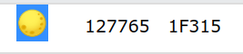
To use this source, you must copy and paste the string in the "class" to the informaiton model, e.g.
logo: “faw:fas fa-toggle-on”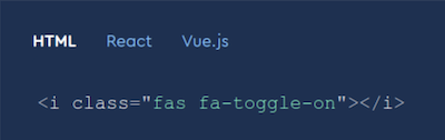
To use this source, you must copy and paste the string to the informaiton model, e.g.
logo: “ion:ios-bulb”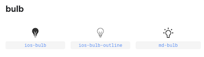
It is not suggested to apply commands with range type of control items (e.g. percentage) because you might have a bunch of icons on the page. This might cause confusions to the users. Or you might need to limit the number of command values.
Event Collections (Optional)
This section is for IFTTT triggers. You should add this section to the information model of the corresponding Family Members for the IFTTT triggers to show up in their IFTTT services.
Name
The name of events is suggested to be unique in the information models in your solution. If the names of events are the same, all the triggers with the same name will be be triggered.
Type
This defines the event type. "triggerEvent" is used for IFTTT triggers. Currently only "triggerEvent" is supported.
Conditions
When the device status matches the conditions defined here, IFTTT triggers will be activated.
Here is some example for eventCollections.
eventCollections:
  - name: fan_at_level_2
    type: triggerEvent
    conditions:
      - key: H01
        op: gte
        target: 2
      - key: H01
        op: lt
        target: 3
Images Schema (Optional)
This section is for the images shown on the mobile app. You can add this section to the information model of your device when you want to use the app template with images. If there is an image uploaded on the admin site, the cloud will automatically update the settings in this section.
Image Name
Field: images
Definition: This field is used to define how image is used. Name your image "thumbnail" if you want it to be shown as thumbnail on the Home Dashboard, "banner" if you want it to be shown as banner on the Device Detail Page.
uri
Field: uri
Definition: This field is used to define the location of the image.
Note
You can also put external link here or leave Images Schema empty and directly upload the image from the admin site. The uri will be updated automatically by cloud.
Full Example
images:
  thumbnail:
    uri: https://<domain>/file_manager/familyName-thumbnail-{timestamp}
  banner:
    uri: https://<domain>/file_manager/familyName-banner-{timestamp}
Field Ranges (Optional)
Device needs to report field ranges appliances supports in array of object format. Mobile app will process the range of the keys listed below and dynamically show the range of the control items based on the definition of this section.
- H00~H50
- More keys by doing
| 0x80(e.g. H03 is equal to H83)
Note
Please make sure there is no conflict on the key settings in the information model.
Supported Control Items
button-group
type: button-group
title: Example
models:
- key: H0F
  values:
  - value: 0
    text: "Low"
  - value: 1
    text: "Medium"
  - value: 2
    text: "High"
In this example, if there is no field ranges setting, mobile app will show three buttons, "Low", "Medium", and "High". When the field ranges defined, mobile app will process the field ranges sent from device and show the corresponding UI by little endian order. For example, when the device sends {"H0F":4}, the value of field range, 4, will be converted to binary number 100 and then mapping the index of '1', which is index 3. Mobile app will only show the matched index, "High".
range
There are two fields you need to define for field ranges feature.
Options
Field: options
Definition: config of Field Ranges feature
type
Field: type
Definition: rule to convert value of field ranges sent from devices
type: range
title: Example
models:
- key: H03
  values:
    min: 0
    max: 15
    step: 5
  options:
    type: 'uint'
In this example, if there is no field ranges setting, mobile app will show a slider bar with 0~15 range and each step interval is 5. When the field ranges defined, mobile app will process the field ranges sent from device based on mechanism defined in options.type and show the corresponding UI. There are 3 converting mechanisms in app sample code. Take field range {"H03":2595} for example,
int
let value = 46527 // the value defined by fields range

let min = value >> 8
if (min > 127) min -= 256

let max = value & 0xFF
if (max > 127) max -= 256

return { min, max, step: 1 }
In this case, the value of field range will be processed as {"min":-75,"max":-65,"step":1}, and mobile app will show a slider bar with -75~65 and each step interval is 1.
uint16
let value = 221205 // the value defined by fields range

let min = value >> 16
let max = value & 0xFFF

return { min, max, step: 1 }
In this case, the value of field range will be processed as {"min":3,"max":21,"step":1}, and mobile app will show a slider bar with 3~21 and each step interval is 1.
Other Than Two Mechanisms Above
let value = 2595 // the value defined by fields range

let min = value >> 8
let max = value & 0xFF

return { min, max, step: 1 }
In this case, the value of field range will be processed as {"min":10,"max":35,"step":1}, and mobile app will show a slider bar with 10~35 and each step interval is 1.
You can refer to the sample code. DOWNLOAD
For more details about uploading information models to the Admin site, you can refer to Managing Information Models in Admin Site section.
Have more questions? Submit a request