Showing Historical Data
With the history page under devices, users can view their device’s historical data for a variety of possible use cases. Maybe your users want to see what’s their recorded air quality in the past week or how much power their device is consumed month to month.
To show the historical data chart in mobile app, you need to define the chartLayout in your information model first. If no chartLayout is defined for a model, the "History" page and navigation will be hidden for that model. Currently, only a line chart type showing continuous data is supported at this time.
For more details on how to set up your information model, you can refer to Using Information Models.
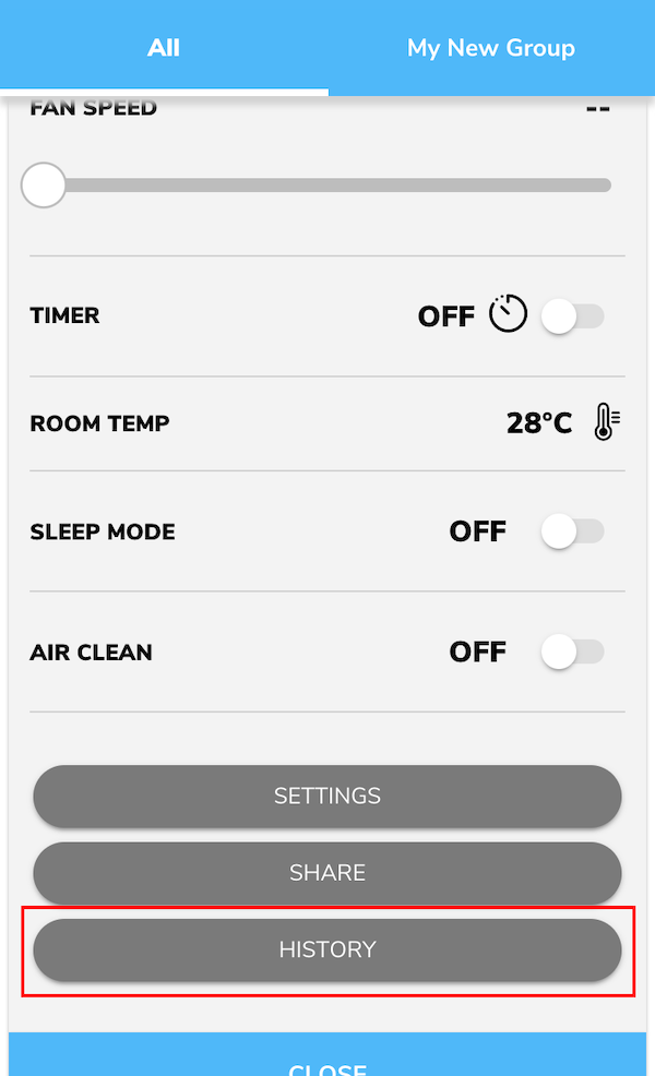
- Example UI of the "History" button (for the Popit List and Popit List with Image app styles).
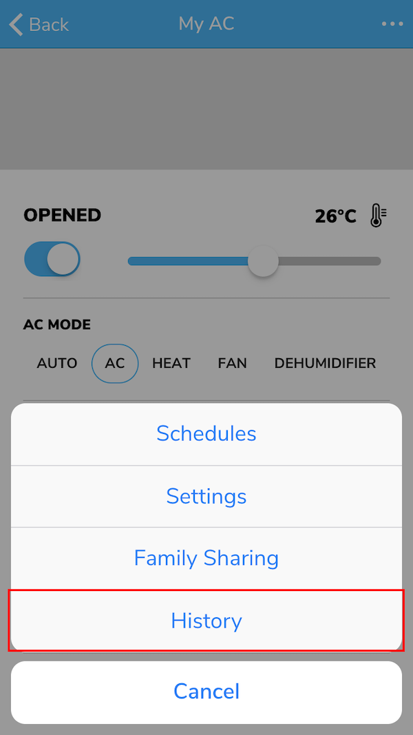
- Example UI of the "History" button (for the Large/Medium/Small List and Large/Medium/Small Grid app styles).
Viewing Data under History
After you set up the Chart Component Model in your information model, you can follow the steps to look up the device data you are interested in.
Steps
-
Choose the device property.
You can scroll to switch between different device properties.
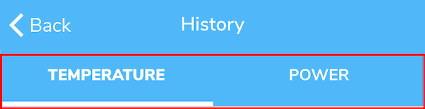
Note
The order of the tabs is based on the order used in the chartLayout of the information model.
-
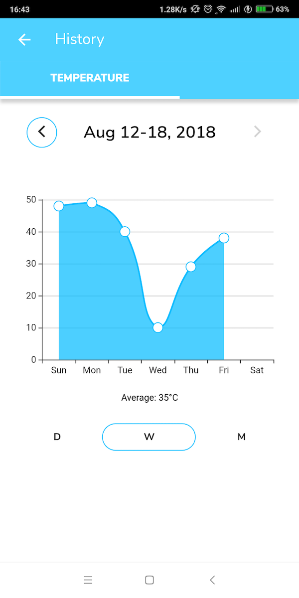
Select the time range.
The default time range will include the current day. You can change the time range by clicking the left or right trigger to move the range to the past or future.
-
Select the time period.
You can select the chart's time period to show in daily, weekly or monthly periods. When switching between different time periods (daily, weekly, or monthly) the range will also default to include the current day. For example, if today is August 12, 2018 and you are viewing the daily device data of June 22, 2018, then you switch to monthly view, it will show August monthly device data.
-
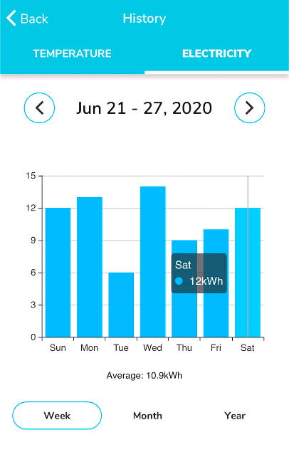
You can see the device data based on the selected device property and viewing range shown in the chart display.
Note
- This chart will show the average data of this period. Each point stands for the daily or hourly average.
-
You can also click the data point on the chart to view details of that data point.
Special Use Case for TaiSEIA Air Conditioner Service ID - H28
If your air conditioners are complied with TaiSEIA protocols, you may use this setting to showcase accumulated power consumption by week, month, and year.
Line chart and bar chart are both supported.
For more details on how to set up in information model you can refer to Special Use Case for TaiSEIA Service ID - H28.
Have more questions? Submit a request