Configuring Your Mobile App Pages
To best suit your customer and product needs, we provide a variety of home dashboard page templates to customize your mobile app layout and user experience.
Styles
Currently there are eight different app styles supported:
| Style | Style Term |
|---|---|
| Popit List | popit-list |
| Popit List with Image | single-accordion |
| Large List | large-list |
| Medium List | medium-list |
| Small List | small-list |
| Large Grid | large-grid |
| Medium Grid | medium-grid |
| Small Grid | small-grid |
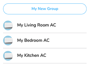
Popit List
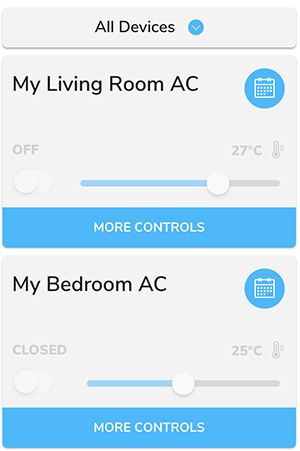
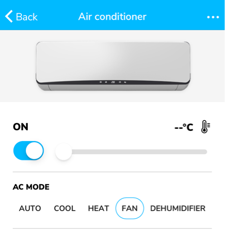
Popit List is the default style of ExoHome mobile app. In this template, each device is displayed in a "popit" container which can be customized to show popular device controls with an expanding behavior to reveal more settings.
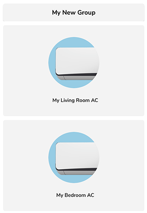
Popit List with Image
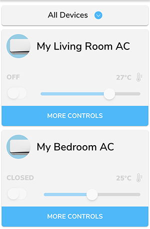
This template is similar to Popit List with an additional model thumbnail image shown inside the popit container. You can define the model image from admin.
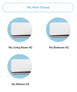
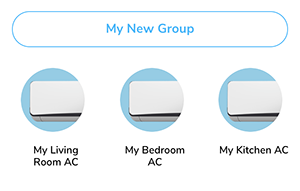
List And Grid
If you would like to support a device detail page, which can be opened by tapping on a device from the home dashboard, a variety of list and grid layouts of different sizes are provided. Choosing a list or grid style will automatically include the device detail page in your app.
Large List
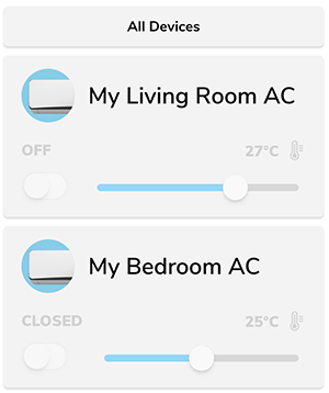
Medium List
Small List
Large Grid
Medium Grid
Small Grid
Changing style
If this is a new project and to be built for the first time, You may use ~/Customer/Common/env.sh file to set the style. See this document for where to place the value.
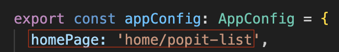
Or open ~/src/app/app.config.ts and modify your homePage tag target value to the style term you want. Example of changing the app style to "Popit List": use home/popit-list.
Please make sure to use the proper style term name.
| Style | Style Term |
|---|---|
| Popit List | popit-list |
| Popit List with Image | single-accordion |
| Large List | large-list |
| Medium List | medium-list |
| Small List | small-list |
| Large Grid | large-grid |
| Medium Grid | medium-grid |
| Small Grid | small-grid |
Thumbnail and Banner
"Thumbnail image" and "Banner image" are two UI elements for some page templates. Thumbnail will be shown on the Home Dashboard and banner will be shown in the Device Detail Page.
Thumbnail

Banner
Both of them are defined in the information model and downloaded from the cloud. When there is no network connection and app can't download the images from the cloud, app will show the placeholder image until the images are downloaded. The default placeholder image is grey background.
The placeholder images are under the src/assets/img/ folder. If you want to use your own placeholder images, you can replace the corresponding files. Both name and type of thumbnail and banner image files should be exactly the same as below.
- Thumbnail:
model_image_thumbnail.png - Banner:
model_image_banner_placeholder.png
Note
- Thumbnail images should be in a square resolution of at least 240 x 240 px, in PNG, JPG or GIF format with a transparent background and under 2MB.
- Banner images should be at least 750 px wide by 240 px tall, in PNG, JPG or GIF format and under 2MB.
Have more questions? Submit a request