Archive for Building APP Versions 2.x.x Under Ionic 3 Framework
Please refer to this archive documents for building APP version 2.x.x.
Porting the Mobile Application Introduction
The ExoHome mobile application is a production-ready design for Exosite customers, with an extensive set of features to bootstrap a product’s user experience, including but not limited to device controls, scheduling, provisioning, group management, family sharing, and user account management.
An overview of the app user experience can be found here in the Mobile App Introduction.
Technical Overview
There are two parts in the App Engine.
- Core Engine: Responsible for all HTTP API calls, database storage, account management, WebSocket request/response, and the creation of promise object for each action.
- Redux Module: Responsible for data cache with a majority of predefined tasks. Cache are updated as soon as tasks are completed.
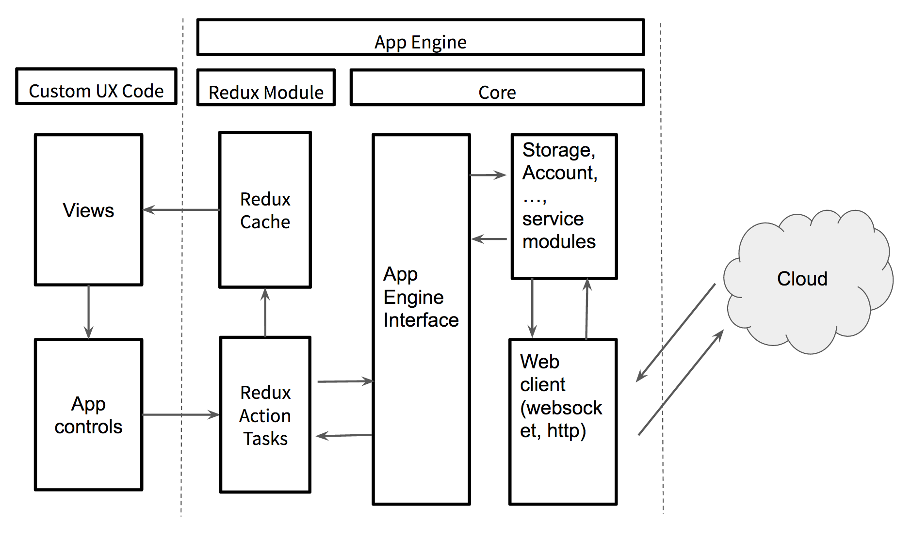
Table of Contents
- Requirements
- Setting Up Your Environment
- Configuring Your App
- Running Your App
- Branding Your App
- Using Information Models
- Configuring Your Mobile App Pages
- Setting Multiple Languages
- Showing Historical Data
- Publishing Your App
- Troubleshooting
- App Config
Requirements
Hardware Requirements
- Linux / Mac (required for iOS development)
- iOS / Android Phone
Software Requirements
- iOS 10~ / Android 6.0~
- Ionic 3 / Apache Cordova
- IDE or editor: Visual Studio Code (Recommended), Atom, or etc.
- NVM
- NodeJS 10
- Xcode https://developer.apple.com/xcode/
- Android Studio / Android SDK
- Java SDK 8.0 or higher
- Free or paid Apple developer account (needed for App distribution) https://appleid.apple.com/
- Android (Gmail) developer account (needed for App distribution)
Setting Up Your Environment
Please note that we only guarantee the released sample code as a verified and functional app building environment. If you find a critical issue with your app, you can use the same environment as our released sample code to build your app and test again.
Install Node - https://nodejs.org/en/
Steps
-
To start, we recommend installing NVM (Node Version Manager). Please refer to the NVM Repository to install NVM.
-
Next in your terminal, install Node using
nvm install 10.nvm install 10 -
You can now check and make sure Node and npm have been installed.
node --version && npm --version -
For future use, you should set your default Node version with
nvm alias defaultandnvm use default.nvm alias default 10nvm use default
Install Ionic - https://ionicframework.com/
Steps
-
Install Ionic using
npm install -g cordova ionic.npm install -g cordova ionic -
You can now check your version using
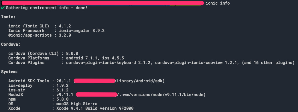
ionic info.ionic info
Note
You may see this update message after running ionic info. If you want the Ionic CLI to check for CLI updates automatically choose "Yes".

Configuring Your Mobile App
In this article, we will cover how to set up your Ionic project from the ExoHome™ app. You can download ExoHome™ SDK in the release note.
By the end of this article, you will have done the following,
Set Up Your App ID and App Name
Every app has an App ID, to uniquely identify your app on a device or publishing store, and an App Name, the display name shown to your end-users. You should choose a name and id unique to your application.
Note
You can always update this later, before publishing.
Steps
-
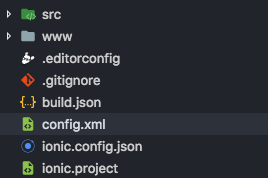
Open "config.xml", under the hamv_mobile folder.
-
Change your App ID and App Name, shown as "com.example.myapp" and "Exosite ExoHome". Note that App ID is interchangeably with Package Name for Android and Bundle ID for iOS.

Important notice about "config.xml" and "package.json"
__
Once you install a platform in the "Running the App" tutorial, any time you change your "config.xml" or "package.json", you need to do the following remove commands and then reinstall the dependencies and platforms.
__
1. Remove node_modules, plugins and platforms
cd hamv_mobile
rm -rf node_modules
rm -rf plugins
rm -rf platforms
2. Remove platform
ionic cordova platform rm android
ionic cordova platform rm ios
3. Reinstall project dependencies
npm install
Set Up Deep Links
To seamlessly redirect users to your installed app from another location, such as the welcome or reset password landing pages, follow the provided steps. Redirecting to the app will not work without setup.
Note 1
You can always update this later, before publishing.
Note 2
Please make sure you change the deep links and don't use the default ones.
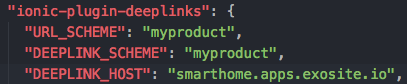
- Open "package.json".
- Change your URL_SCHEME, DEEPLINK_SCHEME and DEEPLINK_HOST in your "package.json".
The URL_SCHEME and DEEPLINK_SCHEME should match the App Url Scheme under your Admin site "Theme" section.
The DEEPLINK_HOST should match your domain URL that Exosite provided.
Note
Scheme and host name matching in the Android framework is case-sensitive, unlike the RFC. As a result, you should always specify schemes using lowercase letters. See Android - Data Element
References
Set Up Solution Host and Product Host
Steps
-
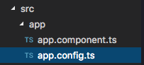
Open "app.config.ts", under hamv_mobile/src/app/.
-
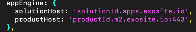
Change your solutionHost, shown as "solutionId.apps.exosite.io" by default. Replace the value to the one Exosite provided.
-
Change your productHost, shown as "productId.m2.exosite.io:443" by default. Replace the value to the one Exosite provided.
Running Your Application
In this article, we will cover how to compile and run your app on a real device.
By the end of this article, you will have done the following,
Install Dependencies
Steps
- To install the project dependencies, while in your project directory run
npm install.
cd hamv_mobile
npm install
Tip: You can now preview the app in a browser using
ionic serve.ionic serveNote, this runs in debug mode with error handling, but most logs can be ignored at this time. Your browser should open automatically once the application is ready. If not, in your browser open http://localhost:8100/
Build the Platforms
Steps
-
Before adding a platform, you must have an Ionic account. To sign up for an Ionic account, run
ionic signupand follow the steps on screen.ionic signup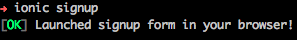
-
Now you can create an Android/iOS project using
ionic cordova platform add androidorionic cordova platform add ios.- Android (Please run the following one by one)
Then add these lines:ionic cordova platform add androidsed -i 's/defaultBuildToolsVersion="29.0.2"/defaultBuildToolsVersion="30.0.2"/g' platforms/android/build.gradle sed -i 's/defaultTargetSdkVersion=29/defaultTargetSdkVersion=30/g' platforms/android/build.gradle sed -i 's/defaultCompileSdkVersion=29/defaultCompileSdkVersion=30/g' platforms/android/build.gradle sed -i 's/target=android-29/target=android-30/g' platforms/android/project.properties sed -i 's/target=android-29/target=android-30/g' platforms/android/CordovaLib/project.propertiesFinally, run “ionic cordova build android --prod --release”.
- iOS
ionic cordova platform add ios
Note
The first platform installation may take awhile to set up. (Estimated time: 15-20 minutes)
Congratulations! Your Ionic project is now ready to run on your phone.
Run the App on a Phone
Run on Android
Steps
-
Install Android Studio. https://developer.android.com/studio/index.html
-
Modify your bash file (Optional).
- For Linux: Modify your .bashrc file and add below content.
- For Mac: Modify your .bash_profile file and add below content.
export PATH=${PATH}:\~/Library/Android/sdk/tools:\~/Library/Android/sdk/platform-tools:\~/Library/Android/sdk/tools/bin -
Install the Android SDK (See Android Cordova)
To install, open the Android SDK Manager (run
androidorsdkmanagerfrom your terminal) and make sure the following are installed:- Android Platform SDK for your targeted version of Android
- Android SDK build-tools version 19.1.0 or higher
- Android Support Repository (found under "Extras")
-
Enable USB debugging and Developer Mode on your Android device, then run
ionic cordova run android --prod --devicefrom your terminal.ionic cordova run android --prod --deviceTo only build your app, run
ionic cordova build android --prodionic cordova build android --prod
Run on iOS
Steps
-
Download Xcode from App Store and update to latest version.
This software installation can take awhile to set up.
-
Agree to the development license.
sudo xcodebuild -license accept -
Install an iOS simulator running
npm i -g ios-deploy ios-sim.npm i -g ios-deploy ios-sim -
Set up a developer certificate for your iOS app.
(1) This requires free or paid Apple developer account. You can sign up here, https://appleid.apple.com/
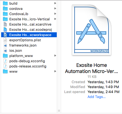
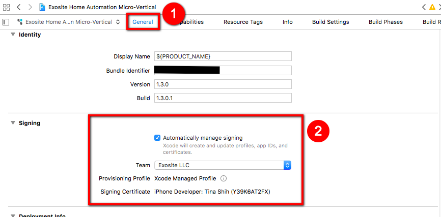
(2) Open ".xcworkspace" in Xcode. The file should be under
/platforms/ios/.xcworkspace(3) Set a developer certificate for your app, as pictured below. Select your project in the left side menu, make sure you're in "General", then finally select your developer certificate under "Team", in the "Signing" section.
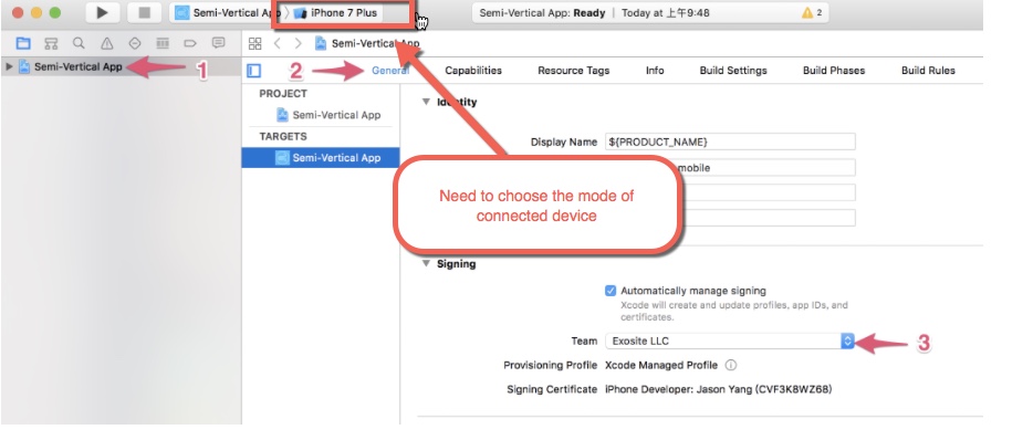
(4) You can now close Xcode.
-
Build your app by running
ionic cordova build ios --prod -- --buildFlag="-UseModernBuildSystem=0"from your terminal.ionic cordova build ios --prod -- --buildFlag="-UseModernBuildSystem=0" -
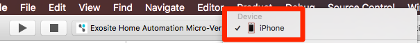
Reopen your ".xcworkspace" in Xcode, then connect your phone via USB and select it as the run target, as pictured below.
-
You can now run your app on your phone by clicking the play button. Make sure your device remains USB connected and unlocked.

Branding Your App
Most of the basic app styles can be managed from the Admin site under "Theme", including your:
- Product Name
- Primary Color
- App Logo
- Navbar Logo
With your app now running, we recommend you update the app's theme on the Admin site. There are also two important exceptions to managing your app design, the App Icon and Splash Screen, which are created when building the app. In this article, we will cover how to update these images.
Updating the App Icon and Splash Screen
App Icon: This image is shown as your application icon on the device home screen.
Note
If you have notification system feature, app icon will also be the icon shown in a push notification.
Splash Screen: This image is shown when opening your app.
Steps
-
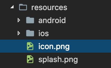
Go to folder hamv_mobile/resources/ and change the "icon.png" with your own app icon design.
-
Also in the folder hamv_mobile/resources/, change the "splash.png" with your own splash screen design.
-
Next, run the command
ionic cordova resources.ionic cordova resourcesNote
To run command
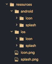
ionic cordova resources, the Ionic CLI requires an Ionic account. You may need to provide your email and password, or sign up for an account if you haven't already. This will generate new images based on the "icon.png" and “splash.png” files. You should see your new images under theresources/androidandresources/iosfolders.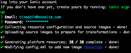
-
Now the next time you build your app for android or iOS, your new App Icon and Splash Screen will be included.
Note
- Splash Screen
- Required image size:4098 × 3312 pixels.
ionic cordova resourcesmay not work if the image size is different.
- The artwork will be cropped and resized automatically to support multiple screen resolutions.
- App Icon
- Required image size: 1024 x 1024 pixels
ionic cordova resourcesmay not work if the image size is different.- The artwork will be cropped and resized automatically to support multiple screen resolutions.
- The artwork should have no rounded corners as each platform will modify and add their preferred effects; for example, the iOS platform will add rounded corners to the app icon.
- To use a different icons for Android and iOS, the image should follow this path, Android: resources/android/icon.png, iOS: image for iOS should use this path: resources/ios/icon.png
Using Information Models
Exosite's information model design allows you to upload product model settings to the cloud and make changes to your app's UI without writing any code or rebuilding the app. Using information models, you can configure your product's UI components and set up integration services like Alexa and Google Home.
Process of Loading Corresponding Information Model
Mobile app will run from the first rule to the final rule to see which is the corresponding information model.
- The device model name is the same as familyName of the information model.
- The device model name matches the familyMembers of the information model.
- Custom rules if there is any. The custom rules will be in
src/modules/information-model/custom/model-dispatch-helper.ts.
Note
- If the prior rule is matched, mobile app won't check the next rule.
- If all the rules are not matched, there will be no device UI shown on mobile app.
- For integration schema, ExoHome will only check whether device model name matches the familyMembers of the information model or not at this time.
Create Your Own Information Models
To get started, we already provided some example information models under the folder/src/assets/models/.
Information models are loaded from this folder, as well as from the Admin site's "Information Model" tab, with the most recent version being cached.
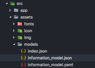
Index.json
The "index.json" is used to tell which local files to load. Note, this does not apply to any files uploaded to your Admin site.
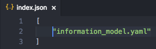
JSON or YAML
Currently, we support 2 formats, JSON and YAML. You can choose the one you are more familiar with to create your own model. App can load files in different formats at the same time.
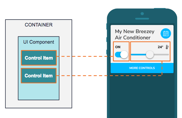
Container Model
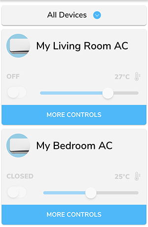
A container represents a "popit." A “popit” is a compact, feature focused interface for device activities and actions. You can click “More Controls” to expand the interface. The scope for this container includes the entire interface for a device.
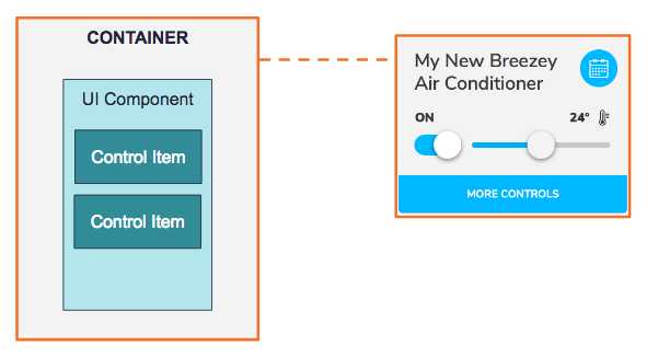
The primary goals for the container model are:
- Describing the layout for UI components.
- Defining the supported devices in this family.
Here is some sample code.
familyName: EXAMPLE DEVICE
familyMembers:
  - DEVICE MODEL ID
  - "EXO.*"
controlLayout:
  primary:
  - UI_Component_1
  - UI_Component_2
  secondary:
  - UI_Component_3
scheduleLayout:
  primary:
  - UI_Component_1
  - UI_Component_2
  - UI_Component_3
chartLayout:
  main:
    - MY_CHART_1
chartComponents:
  MY_CHART_1:
    type: line-chart
    title: INFORMATION_MODEL.TEMPERATURE
    models:
    - key: H03
      values:
        min: 16
        max: 32
        step: 1
        func: tempCelsius
hiddenFields:
- H28
errorFields:
...
deviceId: 1
components:
  UI_Component_1:
  UI_Component_2:
  UI_Component_3:
integration:
  traits:
    ...
Family Name
Field: familyName
Definition: Name of individual config files.
The name should be unique to the config files in the App. If there are duplicate names, the later config file will overwrite the previous one.
Note
This is the first rule mobile app will check for the corresponding information model.
Family Members
Field: familyMembers
Definition: Supported devices under this family.
This field is used to define the supported device models for the config file. It supports string or regular expression.
Control Layout
Field: controlLayout
Definition: Layout of the Control Items in the Device UI.
This field is used define the order of the control items in the control layouts which are primary and secondary layouts. The controls items will display based on the order defined here.
Schedule Layout
Field: scheduleLayout
Definition: Layout of the Control Items in the Schedule page.
This field is used to define the order of the control items in the schedule view which are primary and secondary layouts. The controls items will display based on the order defined here.
Schedule function might not be applicable for certain devices, such as washing machine, so you may leave this field blank to hide the schedule icon.
Note
Remove schedule icon can only be applied to the following layout style: Popit List and Popit List with Image.
Chart Layout
Field: chartLayout
Definition: Layout of the chart items in the device history page
This field is used to define the order of the chart items in the history page. The order of device properties will be shown as defined here.
The main section is required in the chartLayout. For example:
chartLayout:
  main:
    - MY_CHART_1
    - MY_CHART_2
Device ID
Field: deviceId
Definition: Device ID
The value of this field is based on the type of Home Appliance. If AC is defined as 1, all devices with Device ID equals to 1 will be viewed as AC.
Hidden Fields (Optional)
Field: hiddenFields
Definition: List of hidden control items
If a field is used for the data collection or troubleshooting with no need to display the information on the UI, those can be listed under this field so that they will be loaded by the APP but will not be shown on the UI. For example, H28 is a field for power usage data which should be sent by the module to cloud but should not be shown on the UI, it can be list under this field.
Error Fields (Optional)
Field: errorFields (Optional)
Definition: List of fields that carry error information
The errorFields is used for error reports to indicate which fields are carrying errors and will be shown on admin site as error logs.
Error Example
  "errorFields": [
    {
      "key": "H29",
      "values": [
        {
          "value": 13,
          "text": "WATER TEMPERATURE TOO HIGH"
        },
        {
          "value": 85,
          "text": "ERROR IN VFD"
        }
      ]
    }
  ]
Note
RangeandRulesare not supported in ErrorFields.- It will be shown as error logs on the admin site.
Component Repository
Field: components
Definition: Component repository
All available UI components candidates and its related information are stored in the component repository as key-value pair. The same key in this key-value pair is used to define what UI component to use in “controlLayout” or “scheduleLayout”.
UI Component Model
Under the container, there can be many UI components. The highlighted box on the right indicates a UI component on the primary layout.
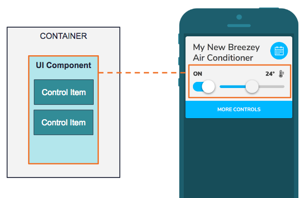
The App will load the UI component based on the type provided in this model and render UI of control items accordingly.
Here is some sample code.
components:
  UI_Component_1:
    type: button-group
    title: POWER
    models:
    - key: H00
      values:
      - value: 0
        text: 'OFF'
      - value: 1
        text: 'ON'
  Other_Component:
HideFromGroup (Optional)
Field: hideFromGroup
Definition: Set true if you want to hide this component from the group control. If you set the value as false, the result would be the same as without this property.
For example:
UI_Component_example:
  hideFromGroup: true
  type: range-with-toggle
  title: Example
  models:
  ...
Type
Field: type
Definition: UI component types
See below for the UI components provided in the current version. User can add their own customized UI components.
R (read only): Allow user to read status data only R+W (read and write): Allow user to read status data and control it.
- button-group (R+W)
- range (R+W)
- text (R)
- toggle (R+W)
- range-with-toggle (R+W) Order of control items in the definition:
- Range
- Toggle
- large-toggle-with-range (R+W) Order of control items in the definition:
- Range
- Toggle
- button-group-with-toggle (R+W) Order of control items in the definition:
- Button group
- Toggle
Title
Field: title (Optional)
Definition: Title to be displayed
Models
Field: models
Definition: Models for Control Items
It may contain one or more control items. For example, “range-with-toggle”, it includes two set of data, one is for range and another is for toggle.
UI_Component_example:
  type: range-with-toggle
  title: Example
  models:
  - key: H00
    values:
    - value: 5
      text: Item #1
    - value: 4
      text: Item #2
    - value: 3
      text: Item #3
    - value: 2
      text: Item #4
    - value: 1
      text: Item #5
  - key: H00
    values:
    - value: "*"
    - value: 0
      text: AUTO
    default: 3
Chart Component Model
The history page under a device displays historical data for users. You can set which device properties are displayed and customize each charts display using the settings below.
Here is some sample code.
chartComponents:
  MY_CHART_1:
   type: line-chart
   title: Temperature
   models:
   - key: H03
      values:
        min: 16
        max: 32
        step: 1
        func: tempCelsius
  MY_CHART_2:
    ...
Type
Field: type
Definition: The type of chart component used
Currently one chart type is provided in the current version.
- line-chart
Title
Field: title
Definition: The title text displayed in the tab
Models
Field: models
Definition: The models for the chart
This contains one control item. The definition between chart component and UI component is the same, but under chart component disable rules and dependency rules won't affect anything.
SpecIal Use Case for TaiSEIA Service ID - H28 (accumulated power consumption)
type: line-chart and bar-chart are both supported
func: accumulatedElectricity
chartComponents:
  HISTORICAL_CHART:
    type: bar-chart
    models:
    - key: H28
      values:
        func: accumulatedElectricity
        max: 10
        min: 0
        step: 1
    title: INFORMATION_MODEL.ELECTRICITY
Control Item Model
A control item is a minimum unit to define how real device data is being connected and controlled, as well as showing dependency based on other information of the same device. There might be one or more control items in the UI component. The example below is a compound component called Range with Toggle. You can define the text shown on the component, the image as well as the value you send when user slides on the range bar or switch the toggle. It will also display the device state based on this information.
Key
Field: key
Definition: The field the control item interacts with.
Define which field on the ESH table the control item should read the data from and/or send the value to. For example, for ACs (Device ID=1), H01 for is “AC mode”.
Note
For SAANET devices, "key" values must use a capital H to work properly.
Values
Field: values
We provide two ways to define values currently: listing and range. See below:
LISTING
values:
  - value: 0
    text: "ON"
  - value: 1
    text: "OFF"
RANGE
(1) Using predefined function
values:
  min: 16
  max: 32
  step: 1
  func: "tempCelsius"
OR
(2) Using rules
values:
  min: 16
  max: 32
  step: 1
  rules:
  - conditions:
    - key: H00
      op: gte
      target: 16
    - key: H00
      op: lt
      target: 24
    result:
      text: cool
  - conditions:
    - key: H00
      op: gte
      target: 24
    - key: H00
      op: lt
      target: 32
    result:
      text: normal
When the device data should be calculated and processed before shown on the UI, it is suggested to use a predefined function (1) . When the device data needs to be interpreted based on certain conditions, it is suggested to use rules (2). When predefined function and rules exist at the same time, predefined function takes the priority.
Default
Field: default
Definition: default setting of a control item
When using the “*” symbol in the value field, it means “*” can be any value. In this case, a default value should be assigned, and this value will be sent when user controls this component. For example, when H00 equals to 0, it will show “AUTO”. On the other hand, when H00 equals to any value except for 0, it won’t show anything on display and send default value, 3 in this case.
UI_Component_example:
  type: toggle
  title: Example
  models:
  - key: H00
    values:
    - value: "*"
    - value: 0
      text: AUTO
    default: 3
Dependency Rules
Field: dependency (optional)
Definition: rules to describe the interdependent relationship between different keys
The dependency rules are used when the control options of the device needs to be changed based on other device data. For example, the dependency rule can be used if the options of the fan speed in an AC changes based on the AC mode.
AC_FAN_SPEED:
  type: range-with-toggle
  title: FAN SPEED
  models:
  - key: H02
    values:
    - value: 0
      text: AUTO
    - value: 4
      text: HIGH
    - value: 3
      text: LOW
    - value: 2
      text: WEAK
    - value: 1
      text: SILENT
    dependency:
    - conditions:
      - key: H01
        op: eq
        target: 1
      result:
        values:
        - value: 0
          text: AUTO
        - value: 4
          text: HIGH
        - value: 3
          text: LOW
    - conditions:
      - key: H01
        op: eq
        target: 3
      result:
        values:
        - value: 0
          text: AUTO
        - value: 1
          text: SILENT
        - value: 2
          text: WEAK
In the above example, H01 means AC Mode and H02 means Fan Speed. It shows how a dependency between different device states are set up. For example, When AC mode equals to 1, you will display AUTO, High and Low as options under the fan speed.
Disable Rules
Field: disable (Optional)
Definition: the rule of disabling setting
If the control items will be limited because of other status data, you can use this rule to adjust the control items. For example, AC’s power setting will determine whether user can set other control items, so you can add disable rule for this condition.
AC_TIMER:
  type: range
  title: TIMER
  models:
  - key: H06
    values:
      min: 0
      max: 1440
      step: 60
      func: timer
    disable:
    - conditions:
      - key: H00
        op: eq
        target: 0
H00 means the AC’s power setting and H06 means the timer setting.
Rule and Concept
Rules and Conditions is an essential part of the information model. It is used to describe the dependency between device properties/fields and to define disable states and controls the values in the control items. The section below describe how they can be applied.
Rule
Each rule equals to a “If...then” expression, so each rule includes one or more conditions and one or no result. When combining multiple rules, it could be something like the descriptions below:
IF condition1 AND condition2 THEN result1 // RULE 1
ELSE IF condition3 AND condition4 THEN result2 // RULE 2
... other rules ...
In order to simplify the complexity of this model, it will only return the result when all conditions in a rule are true. In other words, each condition is connected by “AND.” If there are “OR” conditions, it will be viewed as two different rules, for example:
IF condition1 OR condition2 THEN result1
equals to
IF condition1 THEN result1
ELSE IF condition2 THEN result1
Condition
There are 3 properties under a condition:
- Key
- Operation
- Target
Key
Field: key Definition: the field in the ESH table that the condition refers to.
Indicates a specific field on a device, i.e. H00, H01...etc. The parser of the app will take this key as a reference value to determine whether a condition is true.
conditions:
- key: "*"
  op: eq
  target: 0
equals to
conditions:
- key: H00
  op: eq
  target: 0
Operation
Currently the supported operators are listed below:
- "eq" - equal to
- "neq" - not equal to
- "lt" - less than
- "lte" - less than or equal to
- "gt" - greater than
- "gte" - greater than or equal to
Target
The target value that is being compared: integer (e.g. 1000, -2, +3, 0)
Result returned in values
When result is returned in values, it means the status needs to returned to the UI, and the definition of the returned data would be:
- text: item#1
  icon: state-icon
If you want to replace the content to the data from device, you can use __value__.
- text: __value__
  icon: state-icon
Below is a complete example. When the temperature range is between 16 and 32. It will show the temperature data from the device, like 25.
values:
  min: 16
  max: 32
  step: 1
  rules:
  - conditions:
    - key: "*"
      op: gte
      target: 16
    - key: "*"
      op: lte
      target: 32
    result:
      text: __value__°C
Result returned in dependency
When response is returned in dependency, it means a new definition of values should be returned, for example:
dependency:
- conditions:
  - key: H01
    op: eq
    target: 1
  result:
    values:
    - value: 0
      text: AUTO
    - value: 4
      text: HIGH
    - value: 3
      text: LOW
- conditions:
  - key: H01
    op: eq
    target: 3
  result:
    values:
    - value: 0
      text: AUTO
    - value: 1
      text: SILENT
    - value: 2
      text: WEAK
Assuming H01 equals to AC mode and the options in Fan speed varies based on which AC mode a user is at. In this case, a dependency is used to handle this logic.
- If AC mode equals to 1, then the fan speed options will be “AUTO,HIGH, LOW”.
- If AC mode equals to 3, then the fan speed options will be “AUTO, SILENT, WEAK”.
- If AC mode equals none of the above conditions, then the fan speed options will display the default options.
Result returned in disable
When response is returned in disable , in this case, it will only return boolean, so no result is needed. For example:
disable:
- conditions:
  - key: H00
    op: eq
    target: 0
Custom Information Model Module (Advanced)
If you want to do advanced setting, you can go to/src/modules/information-model/ where we put the module.
Here you will find the two folders named"custom" and “logics”. The content under “custom” folder is mainly to enhance creating and selecting the information model. On the other hand, the content under “logics” folder is mainly to provide the predefined logics for UI components, in order to increase the efficiency of developing custom UI components.
Custom Folder
This folder includes two items-"predefined functions" and “model dispatch helper”.
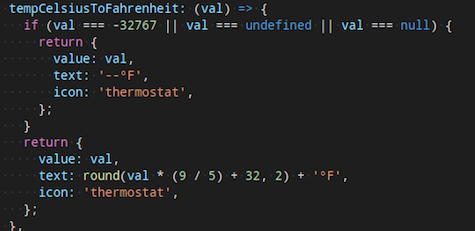
- Predefined Functions
If the device requires some special numerical conversion (e.g. temperature degree conversion), you can add new formula using the "predefined function". Here is a temperature conversion example from Celsius to Fahrenheit.
- Model Dispatch Helper
If the selection of information model does not only depend on the "model name" of the device, but also other information from the device, you could place the processing logic under “model dispatch helper”.
This function should return the "name" of the model, if the responded value is not an empty string, undefined or null, the app will take the name of this model as default setting.
Logic Folder
Under the information model module, we have separated the common binding logics from UI as independent logic component, to simplify the complexity of binding UI component and model.
The main purpose of the separation is to allow developers to reutilize the logic components from here while developing custom UI components, in order to focus on UI layout and design.
Here are four binding logics available:
- Button Group Logic
- Range Logic
- Toggle Logic
- Read Only Logic
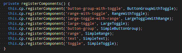
Register a New UI Component
When developer finished a new UI component development, you can register a new UI component from/src/app/app.components.ts. The registered name will be used in this information model.
Additional Tips
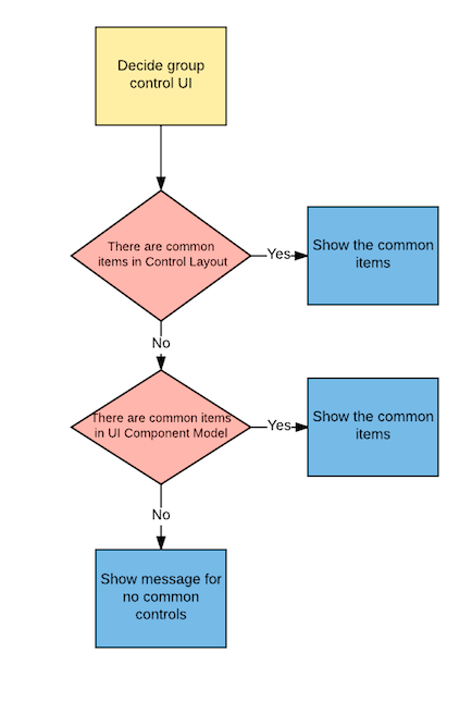
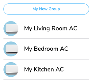
Group Control UI Display Principle
App only shows the common items shared by all devices / information models in the same group. The process and logics are handled by App as below.
- Screen all information models for the devices in the same group, compare the UI components in the Control Layout. If there are common items, App will show the common items in the Group Control UI.
- If no common items are found in the Control Layout, it will then compare one level up in the UI component Model. If there are common items, App will show the common items in the Group Control UI.
- If no common items are found in both Control Layout and UI component Model, App will show a message saying that no common controls can be found for this group.
Integration Schema (Optional)
This section is for third-party service integration. You can add this section to the information model of your device when you want to set up integration services like Alexa, Google Home, IFTTT and SmartThings actions.
Traits
Field: traits
Definition: Traits are the top-level element in the integration schema.
Traits allow individual devices to be represented as multiple independent devices towards integrations. This is often helpful for Alexa and Google Home when your device supports more switches and controls than a single Alexa Skill supports. For example, when creating a SmartPlug with more than one controllable outlet, it makes sense to create one trait for each of the independent outlets so that each outlet can be controlled using the user's voice via Google Home or Alexa.
Type
Field: type
Definition: Each trait belongs to exactly one type.
The type we supports currently.
- ac
- light
- switch (on/off only)
- smartplug (single outlet) (on/off only)
- fan
- dehumidifier (Google Home only)
- airpurifier (Google Home only)
Here are examples for different types.
Light with percentage example
integration:
  traits:
  - id: 1
    type: light
    description: Smart Light
    attributes:
      on_off:
        key: H00
        values:
          on: 0
          off: 1

      percentage:
        key: H07
        min: 1
        max: 100
        before:
          key: H00
          value: 1
Smart Plug Example With three independent Outlets
integration:
  traits:
  - id: 1
    type: smartplug
    append_name: " 1"
    description: Outlet 1
    attributes:
      on_off:
        key: H00
        values:
          on: 0
          off: 1

  - id: 2
    type: smartplug
    append_name: " 2"
    description: Outlet 2
    attributes:
      on_off:
        key: H10
        values:
          on: 0
          off: 1

  - id: 3
    type: smartplug
    append_name: " 3"
    description: Outlet 3
    attributes:
      on_off:
        key: H20
        values:
          on: 0
          off: 1
ID
Field: id
Definition: ID should be string and needs to be unique.
Append Name
Field: append_name
Definition: Append_name is used to construct a display name for the trait in the integrations. For example when the original device name is "Living Room Plug" then there will be in above examples three devices visible in Alexa and Google Home with the names "Living Room Plug 1", "Living Room Plug 2", "Living Room Plug 3"
Note
The append name is suggested to be different from the type name. If the names of append name and type are the same, all the devices with the same name will be be controlled by external service.
Applied Domain (Optional)
Field: appliedDomain
This field is used to define the integration services that trait applies to. If "appliedDomain" is not provided, the trait will apply to all integration services.
Currently the supported integration services are listed below. Please make sure to use the proper term.
| Integrations | Term |
|---|---|
| Amazon Alexa | alexa |
| Google Home | googlehome |
| IFTTT | ifttt |
| SmartThings | smartthings |
Description (Optional)
Field: description
Definition: This can be used for longer descriptions of the trait inside the integration. It would be displayed in detail views within the Google Home or Alexa application.
Attributes
Field: attributes
Definition: This describes the mapping of known integration semantics to the device keys. A list of all known integration semantics that can be used follows:
| Device | ||||||
| Alexa Skills (field name) | Light | Switch | Smartplug | Thermostat | Smartlock | Fan |
| on_off | v | v | v | v | v | v |
| color_temperature | v | |||||
| brightness | v | |||||
| percentage | v | v | v | |||
| temperature_setting | v | |||||
| alexa_toggles | v | v | ||||
| alexa_modes | v | v | ||||
| fan_speed | v | |||||
| Device | |||||||||
| Google Traits (field name) | Light | Switch | Smartplug | Thermostat | Smartlock | Fan | AC | Air Purifier | Dehumidifier |
| on_off | v | v | v | v | v | v | v | v | v |
| color_temperature | v | ||||||||
| brightness | v | ||||||||
| percentage | v | v | |||||||
| temperature_setting | v | v | |||||||
| toggles | v | v | v | ||||||
| modes | v | v | v | v | v | ||||
| fan_speed | v | v | v | v | |||||
| Device | |||
| SmartThings (field name) | Light | Fan | |
| on_off | v | v | |
| percentage | v | fan_speed | v |
Each attribute can additionally define the before attribute (see examples below). The before attribute will ensure that certain dependencies are triggered before the control acts.
On/Off
Field: on_off
This controls basic on/off on a device. Every device should have this control.
on_off:
  key: H00
  values:
    on: 1
    off: 0
Percentage
Field: percentage
Value is a percentage from 0 to 100 usually and can be used to control the power or speed of smart devices. It also has min and max subfields to define the range (e.g. limit max: below 100%).
Note
Because Google Home does not have explicit percentage we are mapping it to brightness.
percentage:
  before:
  - key: H00
    value: 1
  key: H0F
  max: 100
  min: 1
Brightness
Field: brightness
Value is a percentage from 0 to 100 usually and can be used to control the light brightness. It also has min and max subfields to define the range (e.g. limit max: below 100%).
brightness:
  before:
  - key: H00
    value: 1
  key: H0C
  max: 100
  min: 1
Fan Speed
Field: fan_speed
There are several subfields that support setting the speed of a fan, that is, blowing air from the device at various levels, with settings such as low, medium, high and boost. Fan speeds contains the name of each speed and a subarray for speed_values with language-specific synonyms. For example, the speed_name "low" could correspond to the speed_synonym strings "low" and "speed 1" given the language code "en".
Note
The speed value should be in ascending order so you can increase/decrease fan speed with your voice (See example below).
Speed Name
Field: speed_name
Definition: This field is used to define internal name of the mode, which will be used in commands and states. This will be shared across all languages.
Value
Field: value
Definition: The value of the key for the speed mode.
Speed Value
Field: speed_values
Definition: This field contains a subarray of speed synonyms and supported languages.
Speed Synonym
Field: speed_synonym
Definition: You can define multiple terms here that end-user can use to trigger the speed mode for the corresponding speed_name.
Note
Google Home may not execute as expected if contains numbers.
Language
Field: lang
Definition: Supported language for the speed name. You can refer to Google Home instruction for the supported language and language code.
Reversible (Optional)
Field: reversible
Definition: If your device supports changing fan directions, you can define the value of normal and reverse subfields for the directions.
Note
Set the same value for normal and reverse if the device is agnostic to which direction it is changing to.
fan_speed:
    key: H02
    values:
    - speed_name: low
      value: 25
      speed_values:
      - speed_synonym:
        - low
        - speed low
        lang: en
       - speed_synonym:
        - low
        - speed low
        lang: de
    - speed_name: medium
      value: 50
      speed_values:
      - speed_synonym:
        - medium
        - speed medium
        lang: en
      - speed_synonym:
        - medium
        - speed medium
        lang: de
    reversible:
      key: H06
      values:
        normal: 1
        reverse: 2
Field: transform
Definition: The default SmartThings fan speed control UI has 4 steps: 1, 2, 3, and 4. If your device uses percentage to control the fan speed, you need to map the percentage to the SmartThings fan speed UI. This field goes together with detransform field, and can't be used alone.
For example, speed 1 equals to 25% of the fan speed; speed 4 equals to 100% of the fan speed. You should put 1:25, 2:50, 3:75. 4:100.
Field: deTransform
Definition: This field goes together with transform field and can't be used alone.
Please see the sample code for transform and deTransform below.
fan_speed:
  key: H02
  max: 100
  min: 1
  transform:
    0: 0
    1: 25
    2: 50
    3: 75
    4: 100
  deTransform:
    0: 0
    1: 25
    2: 50
    3: 75
    4: 100
Color Temperature
Field: color_temperature
Value is degrees Kelvin from 1000 to 10000 (Alexa) or 2000 to 9000 (Google Home) to control the light color temperature. It also has min and max subfields to define the range for Google Home only.
color_temperature:
  before:
  - key: H00
    value: 1
  key: H0C
  max: 9000
  min: 2000
Set Temperature
Field: temperature_setting
Temperature setting contains several subfields. You should define the temperature units. Also, you may control the temperature setting in numbers. Or, if your devices provide temperature levels, you may define the names accordingly. e.g. cool, heat, etc.
temperature_setting:
  key: H03
  thermostatTemperatureUnit: C
  thermostatTemperatureRange:
    minThresholdCelsius: 10
    maxThresholdCelsius: 40
  availableThermostatModes:
    key: H01
    values:
      auto: 0
      cool: 1
      dry: 2
      fan-only: 3
      heat: 4
Toggles
Field: toggles
Value is on and off. You should define the name of your toggle, and give the toggle with subfield name_values which describe the synonym of the toggle name. Please remember to set the language (lang) you use in name_values subfield. You may have more than 1 toggle settings according to your device for Google Home (not for Alexa).
Example for Google Home (multiple toggles can be set):
toggles:
- key: H05
  'on': 1
  'off': 0
  name: sleep
  name_values:
    name_synonym:
    - sleep mode
    - sleep
    - shumian
    lang: en
- key: H0e
  'on': 1
  'off': 0
  name: swing
  name_values:
    name_synonym:
    - swing mode
    - swing
    lang: en
Example for Alexa:
alexa_toggles:
  label: Oscillate
  type: text
  key: H05
  values:
    'off': 0
    'on': 1
Modes
Field: modes (Google Home), alexa_modes (Alexa)
Similar to fan speed, there are several subfields to be defined in the modes field according to your device. The name and received value should be defined in availableModes subfield to control the data field(s) like the mode on a device using step control widget. Also provides the configuration to show friendly names in multiple languages.
Example for Google Home
modes:
  availableModes:
  - name: H02
    name_values:
    - name_synonym:
      - direction
      - position
      lang: en
    settings:
    - setting_name: '1'
      setting_values:
      - setting_synonym:
        - '1'
        - one
        - low
        lang: en
    - setting_name: '2'
      setting_values:
      - setting_synonym:
        - '2'
        - two
        - center
        lang: en
    - setting_name: '3'
      setting_values:
      - setting_synonym:
        - '3'
        - three
        - high
        lang: en
    ordered: true
Example for Alexa
alexa_modes:
  ordered: true
  label: Speed
  type: text
  availableModes:
  - name: H02
    name_values:
    - name_synonym:
      - fan speed
      locale: en-US
    settings:
    - setting_name: '0'
      setting_values:
      - setting_synonym:
        - '0'
        - zero
SmartThings (Optional)
Field: smartthings
Definition: SmartThings is a top-level element in the integration schema, same level as traits field. Added only when your solution has integrated with SmartThings.
ExoHome has integrated fan and light SmartThings capabilities. For customers using these devices or customized fan and light devices, a specific SmartThings UI element will be implemented and should be defined in the information model.
Device profile ID
Field: deviceProfileId
Definition: This field is a lower level element to the SmartThings element. If SmartThings is integrated in your solution, you need to put the device profile ID to specify the SmartThings UI in use.
For light only device, please put c2c-dimmer which provides "Switch" and "Switch Level" control UI.
For 4-speed fan devices, please use c2c-fan-controller-4speed which provides "Switch" and "Fan Speed" control UI.
For 3-speed fan or other customized devices, you need to configure your own device profile because they are not a standard SmartThings capability. Please input the device profile ID in this field after the custom device profile is set. You may refer to the SmartThings Integration to learn how to customize device profile in SmartThings.
Shortcuts for iOS Devices (Optional)
This function is for Apple mobile devices. You can define the control functions beforehand, so that the end users can add them to the Shortcuts app. The Shortcuts app is a standalone application in the iOS and can be activated by Siri.
Example for a combo device (ceiling fan with light) with two independant outlets (fan and light):
sirishortcuts:
  sections:
    - title: Fan
      commands:
        - logo: "uni:🌕"
          name: Fan on
          size: 40px
          key: H00
          value: 1
        - logo: "uni:🌑"
          name: Fan off
          size: 40px
          key: H00
          value: 0
        - logo: 'uni:❶'
          size: 55px
          name: Speed 1
          key: H02
          value: 1
        - logo: 'uni:❷'
          name: Speed 2
          size: 55px
          key: H02
          value: 2
    - title: Light
      commands:
        - logo: 'ion:ios-bulb'
          name: Light on
          size: 47px
          key: H00
          value: 1
        - logo: 'ion:ios-bulb-outline'
          name: Light off
          size: 47px
          key: H00
          value: 0
        - logo: 'ion:ios-sunny'
          size: 48px
          name: Mode 1
          key: H01
          value: 1
        - logo: 'ion:ios-cloudy'
          name: Mode 2
          size: 42px
          key: H01
          value: 2
Device Function Group Block
Field: sections
Definition: Create a block to contain similar functions' icons. For example, if this device has several light controls like light on and light off, you may group them together in a block called "Light" or "Light Control".
Device Function Group Block Name
Field: title
Definition: Give a name to the function group block.
Control Item
Field: commands
Definition: Define the exact control items to add to the Shortcuts. It should contain the following fields.
-
Field: logo
Definition: Define the icon you want to show on the page.
-
Field: name
Definition: The unique name of the control item that shows under the icon. This is also the default utterance when using Siri.
-
Field: size
Definition: Define the size of the logo that shows on the page. The default size of the sourced icons might be varied, you must set the size in the information model.
-
Field: key
Definition: Define the corrosponding H key. For example, if you want to control the power of an air conditioner, put H00 in this field.
-
Field: Value
Definition: The exact H key value. For example, if you want to turn on an air conditioner, then the value is 1.
The icon source can be found from these websites:
To use this source, you must copy and paste the icon itself directly to the informaiton model, e.g.
logo: “uni:🌕”
To use this source, you must copy and paste the string in the "class" to the informaiton model, e.g.
logo: “faw:fas fa-toggle-on”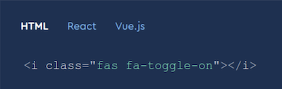
To use this source, you must copy and paste the string to the informaiton model, e.g.
logo: “ion:ios-bulb”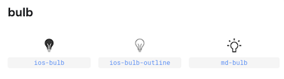
It is not suggested to apply commands with range type of control items (e.g. percentage) because you might have a bunch of icons on the page. This might cause confusions to the users. Or you might need to limit the number of command values.
Event Collections (Optional)
This section is for IFTTT triggers. You should add this section to the information model of the corresponding Family Members for the IFTTT triggers to show up in their IFTTT services.
Name
The name of events is suggested to be unique in the information models in your solution. If the names of events are the same, all the triggers with the same name will be be triggered.
Type
This defines the event type. "triggerEvent" is used for IFTTT triggers. Currently only "triggerEvent" is supported.
Conditions
When the device status matches the conditions defined here, IFTTT triggers will be activated.
Here is some example for eventCollections.
eventCollections:
  - name: fan_at_level_2
    type: triggerEvent
    conditions:
      - key: H01
        op: gte
        target: 2
      - key: H01
        op: lt
        target: 3
Images Schema (Optional)
This section is for the images shown on the mobile app. You can add this section to the information model of your device when you want to use the app template with images. If there is an image uploaded on the admin site, the cloud will automatically update the settings in this section.
Image Name
Field: images
Definition: This field is used to define how image is used. Name your image "thumbnail" if you want it to be shown as thumbnail on the Home Dashboard, "banner" if you want it to be shown as banner on the Device Detail Page.
uri
Field: uri
Definition: This field is used to define the location of the image.
Note
You can also put external link here or leave Images Schema empty and directly upload the image from the admin site. The uri will be updated automatically by cloud.
Full Example
images:
  thumbnail:
    uri: https://<domain>/file_manager/familyName-thumbnail-{timestamp}
  banner:
    uri: https://<domain>/file_manager/familyName-banner-{timestamp}
Field Ranges (Optional)
Device needs to report field ranges appliances supports in array of object format. Mobile app will process the range of the keys listed below and dynamically show the range of the control items based on the definition of this section.
- H00~H50
- More keys by doing
| 0x80(e.g. H03 is equal to H83)
Note
Please make sure there is no conflict on the key settings in the information model.
Supported Control Items
button-group
type: button-group
title: Example
models:
- key: H0F
  values:
  - value: 0
    text: "Low"
  - value: 1
    text: "Medium"
  - value: 2
    text: "High"
In this example, if there is no field ranges setting, mobile app will show three buttons, "Low", "Medium", and "High". When the field ranges defined, mobile app will process the field ranges sent from device and show the corresponding UI by little endian order. For example, when the device sends {"H0F":4}, the value of field range, 4, will be converted to binary number 100 and then mapping the index of '1', which is index 3. Mobile app will only show the matched index, "High".
range
There are two fields you need to define for field ranges feature.
Options
Field: options
Definition: config of Field Ranges feature
type
Field: type
Definition: rule to convert value of field ranges sent from devices
type: range
title: Example
models:
- key: H03
  values:
    min: 0
    max: 15
    step: 5
  options:
    type: 'uint'
In this example, if there is no field ranges setting, mobile app will show a slider bar with 0~15 range and each step interval is 5. When the field ranges defined, mobile app will process the field ranges sent from device based on mechanism defined in options.type and show the corresponding UI. There are 3 converting mechanisms in app sample code. Take field range {"H03":2595} for example,
int
let value = 46527 // the value defined by fields range

let min = value >> 8
if (min > 127) min -= 256

let max = value & 0xFF
if (max > 127) max -= 256

return { min, max, step: 1 }
In this case, the value of field range will be processed as {"min":-75,"max":-65,"step":1}, and mobile app will show a slider bar with -75~65 and each step interval is 1.
uint16
let value = 221205 // the value defined by fields range

let min = value >> 16
let max = value & 0xFFF

return { min, max, step: 1 }
In this case, the value of field range will be processed as {"min":3,"max":21,"step":1}, and mobile app will show a slider bar with 3~21 and each step interval is 1.
Other Than Two Mechanisms Above
let value = 2595 // the value defined by fields range

let min = value >> 8
let max = value & 0xFF

return { min, max, step: 1 }
In this case, the value of field range will be processed as {"min":10,"max":35,"step":1}, and mobile app will show a slider bar with 10~35 and each step interval is 1.
You can refer to the sample code. DOWNLOAD
For more details about uploading information models to the Admin site, you can refer to Managing Information Models in Admin Site section.
Configuring Your Mobile App Pages
To best suit your customer and product needs, we provide a variety of home dashboard page templates to customize your mobile app layout and user experience.
Styles
Currently there are eight different app styles supported:
| Style | Style Term |
|---|---|
| Popit List | PopitListPage |
| Popit List with Image | SingleAccordionPage |
| Large List | LargeListPage |
| Medium List | MediumListPage |
| Small List | SmallListPage |
| Large Grid | LargeGridPage |
| Medium Grid | MediumGridPage |
| Small Grid | SmallGridPage |
Popit List
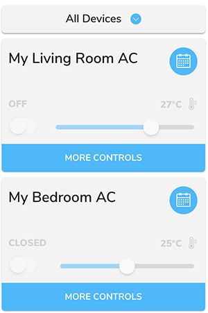
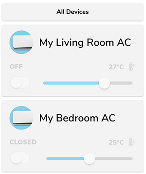
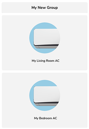
Popit List is the default style of ExoHome mobile app. In this template, each device is displayed in a "popit" container which can be customized to show popular device controls with an expanding behavior to reveal more settings.
Popit List with Image
This template is similar to Popit List with an additional model thumbnail image shown inside the popit container. You can define the model image from admin.
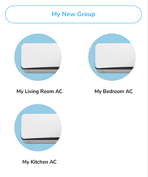
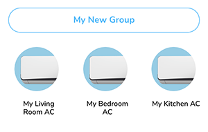
List And Grid
If you would like to support a device detail page, which can be opened by tapping on a device from the home dashboard, a variety of list and grid layouts of different sizes are provided. Choosing a list or grid style will automatically include the device detail page in your app.
Large List
Medium List
Small List
Large Grid
Medium Grid
Small Grid
Changing style
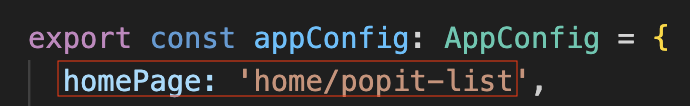
Open src/app/app.routes.ts and modify your "HomePage" tag target value to the style term you want. Example of changing the app style to "PopitListPage".
Please make sure to use the proper style term name.
| Style | Style Term |
|---|---|
| Popit List | PopitListPage |
| Popit List with Image | SingleAccordionPage |
| Large List | LargeListPage |
| Medium List | MediumListPage |
| Small List | SmallListPage |
| Large Grid | LargeGridPage |
| Medium Grid | MediumGridPage |
| Small Grid | SmallGridPage |
Thumbnail and Banner
"Thumbnail image" and "Banner image" are two UI elements for some page templates. Thumbnail will be shown on the Home Dashboard and banner will be shown in the Device Detail Page.
Thumbnail

Banner
Both of them are defined in the information model and downloaded from the cloud. When there is no network connection and app can't download the images from the cloud, app will show the placeholder image until the images are downloaded. The default placeholder image is grey background.
The placeholder images are under the src/assets/img/ folder. If you want to use your own placeholder images, you can replace the corresponding files. Both name and type of thumbnail and banner image files should be exactly the same as below.
- Thumbnail:
model_image_thumbnail.png - Banner:
model_image_banner_placeholder.png
Note
- Thumbnail images should be in a square resolution of at least 240 x 240 px, in PNG, JPG or GIF format with a transparent background and under 2MB.
- Banner images should be at least 750 px wide by 240 px tall, in PNG, JPG or GIF format and under 2MB.
Setting Multiple Languages
By default, the app language will try to match the navigator language of the user's mobile phone. If no match can be found, the first language in the array will be used as the default language.
Add New Locale (Optional)
- To add a new locale, we recommend starting from the English version. Copy the "en-US.json" file under the folder
src/assets/i18n. - Next, translate the value to the target language in the file you just copied. For any new terms you wish to include in your information model, you will need to first add a new key-value pair. See Translate Your Information Model for more information.
-
Save the file using the standardized language codes, e.g.
jp.json. For more examples, see https://stackoverflow.com/a/36042028.Note
This value will be used to compare against the navigator language provided by user's mobile phone. Please use the widely accepted language codes.
-
Add language selections to the APP by modifying this file -
app.languages.tsunder the foldersrc/assets/app.Note
If no matched language locale can be found, the first language in the array will be used as the default language.
Translate Your Information Model
To support translations for any custom terms in your information model, you will need to first add new key-value pairs. Each Title in the information model should have a corresponding entry in the json files under src/assets/i18n.
For example, to translate a new UI Component Model called Smart Mode, you can:
-
In your information model file, type
INFORMATION_MODEL.SMART_MODEin the title field."NEW_UI_COMPONENT": { "type": "button-group", "title": "INFORMATION_MODEL.SMART_MODE", -
Go to your locale files. We'll use "en-US.json" in this example.
-
Find the object
INFORMATION_MODELand addSMART_MODEwith the target language as the value."INFORMATION_MODEL": { "SMART_MODE": "Smart Mode",Note
- Using
INFORMATION_MODELas prefix is just to group the translated terms together as an object, you can organize naming scheme freely. - Currently we only support i18n on the title and the text in the information model.
- If you find the translation is not changed successfully, you can try to do the following remove commands and then reinstall the dependencies and platforms.
- Using
-
Remove platform
ionic cordova platform rm android ionic cordova platform rm ios -
Remove plugins and platforms
rm -rf plugins rm -rf platforms -
Reinstall project dependencies
ionic cordova platform add android
ionic cordova platform add ios
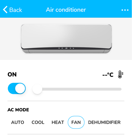
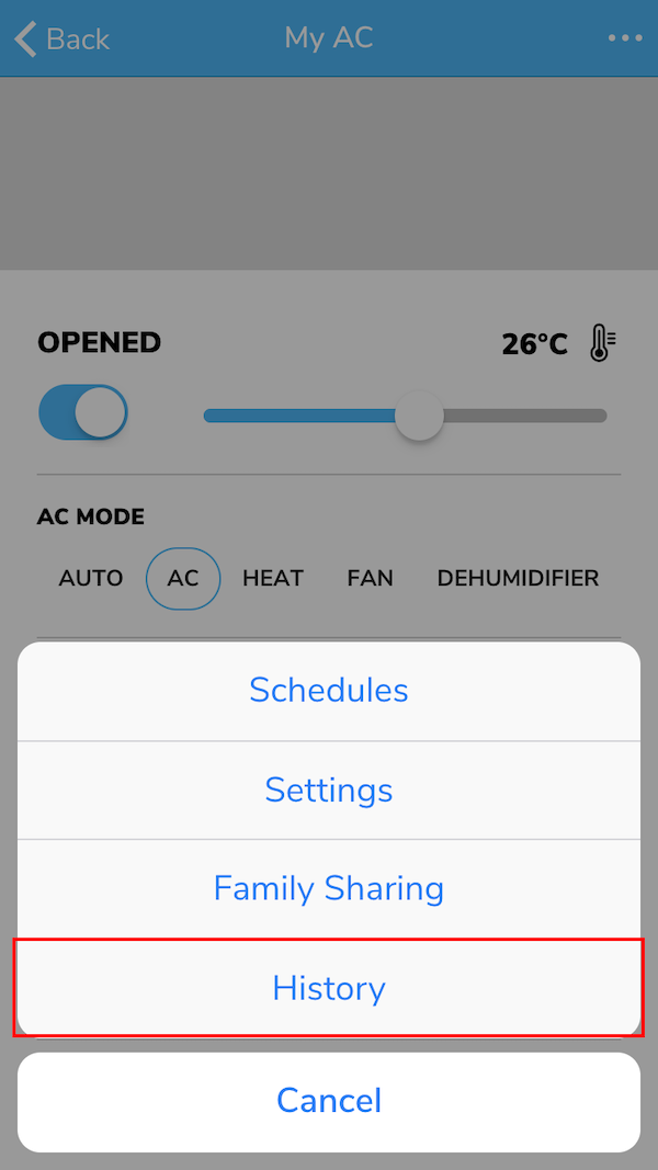
Showing Historical Data
With the history page under devices, users can view their device’s historical data for a variety of possible use cases. Maybe your users want to see what’s their recorded air quality in the past week or how much power their device is consumed month to month.
To show the historical data chart in mobile app, you need to define the chartLayout in your information model first. If no chartLayout is defined for a model, the "History" page and navigation will be hidden for that model. Currently, only a line chart type showing continuous data is supported at this time.
For more details on how to set up your information model, you can refer to Using Information Models.
- Example UI of the "History" button (for the Popit List and Popit List with Image app styles).
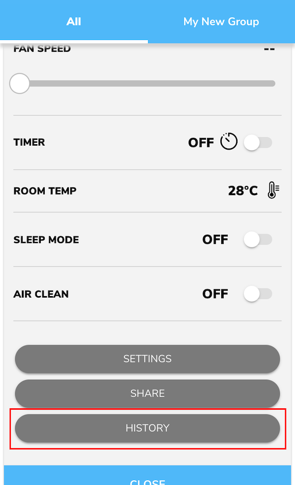
- Example UI of the "History" button (for the Large/Medium/Small List and Large/Medium/Small Grid app styles).
Viewing Data under History
After you set up the Chart Component Model in your information model, you can follow the steps to look up the device data you are interested in.
Steps
-
Choose the device property.
You can scroll to switch between different device properties.
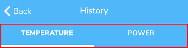
Note
The order of the tabs is based on the order used in the chartLayout of the information model.
-
Select the time range.
The default time range will include the current day. You can change the time range by clicking the left or right trigger to move the range to the past or future.
-
Select the time period.
You can select the chart's time period to show in daily, weekly or monthly periods. When switching between different time periods (daily, weekly, or monthly) the range will also default to include the current day. For example, if today is August 12, 2018 and you are viewing the daily device data of June 22, 2018, then you switch to monthly view, it will show August monthly device data.
-
You can see the device data based on the selected device property and viewing range shown in the chart display.
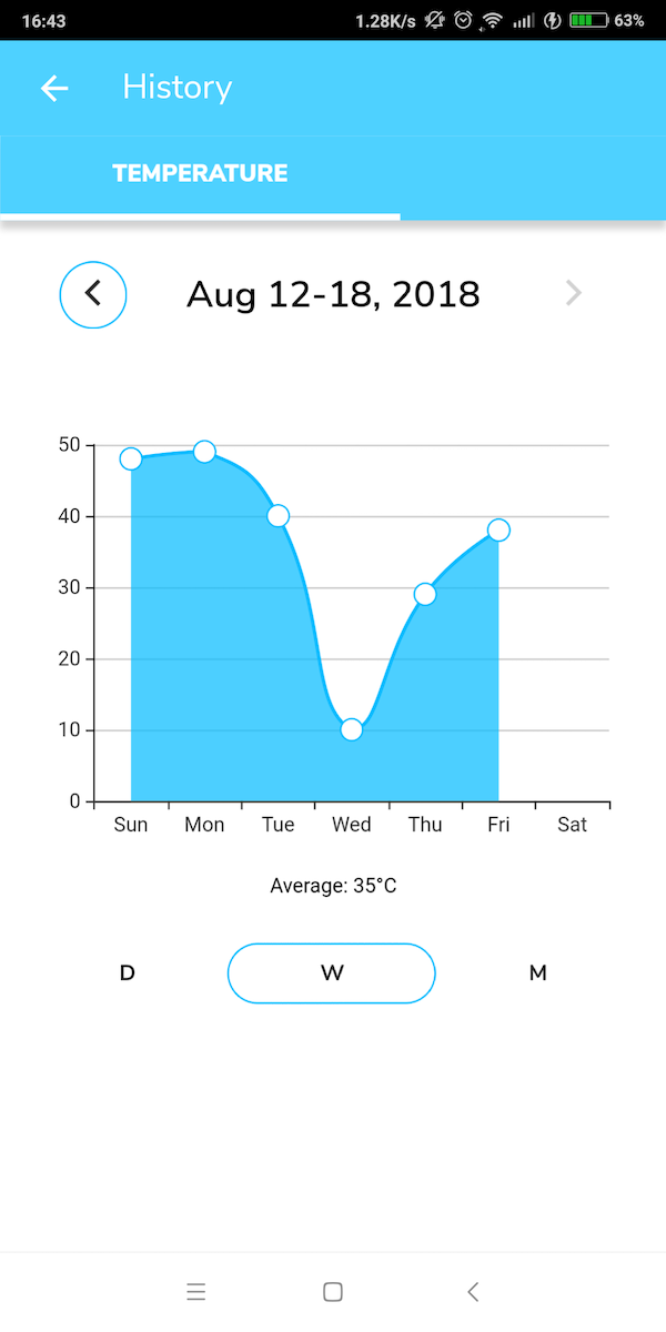
Note
- This chart will show the average data of this period. Each point stands for the daily or hourly average.
-
You can also click the data point on the chart to view details of that data point.
Special Use Case for TaiSEIA Air Conditioner Service ID - H28
If your air conditioners are complied with TaiSEIA protocols, you may use this setting to showcase accumulated power consumption by week, month, and year.
Line chart and bar chart are both supported.
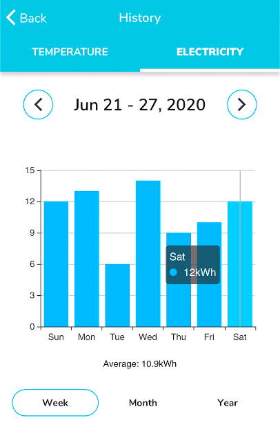
For more details on how to set up in information model you can refer to Special Use Case for TaiSEIA Service ID - H28.
Enabling Firebase Service (Push Notification and Analytics)
Enable Firebase Service on Android
You will need google-services.json for the Firebase Cloud Messaging (FCM) configuration on Android. Please follow the steps to set up notification on Android.
Steps
-
Create an Android application on FCM console.
-
Fill in the information of your Android app.
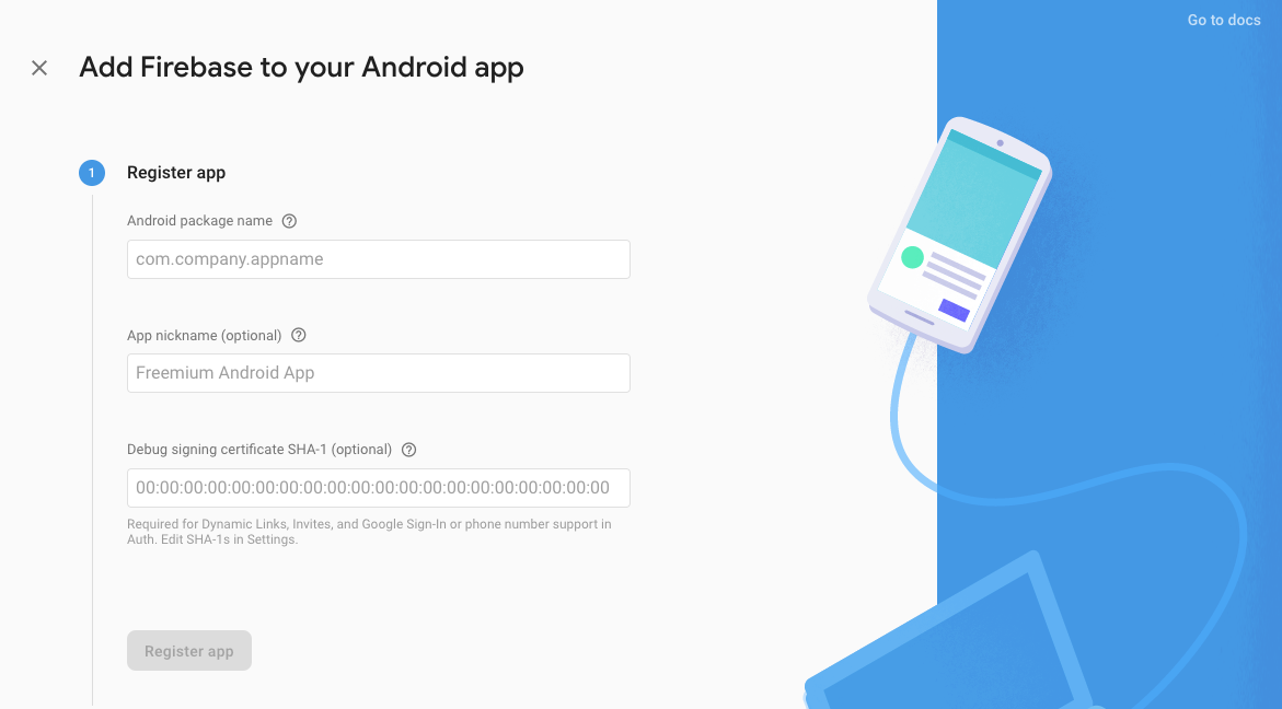
-
Download
google-services.json.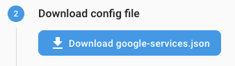
-
Click "Next" to skip the steps for native Android app below.
- Move google-service.json to Android app module root directory
- Add Firebase SDK
-
Stay at the 4th step on the FCM Setting page.
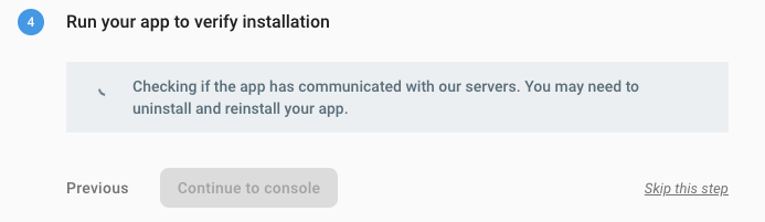
Note
This step is to verify whether your application registered FCM from the client app or not. You will need to build an app to verify it.
-
Set up notification in your Ionic project to proceed with the verification process.
- Add Android platform
ionic cordova platform add android- Copy
google-services.jsontoplatforms/android/app - Build and run your Android App on a real device
ionic cordova run android --device. -
Open your App and check for the installation verification status shown on FCM setting page
Note
If you can't pass the installation verification, please see the readme of the plugin we use to find out for more information.
Enable Firebase Service on iOS
You will need .p8 APNs key for the FCM authorization and GoogleService-Info.plist for the FCM configuration to set up notification on iOS.
Generate .p8 File of APNs Key
Please follow the "Create the authentication key" section of the FCM instruction to generate a .p8 key file containing your APNs Auth Key.
Set Up APNs Key on FCM Console
You need to add an Apple Push Notifications service (APNs) key in Apple Developer in advance. Go to Apple Developer → Certificates, Identifiers & Profiles → Keys, and add a key as showed below:
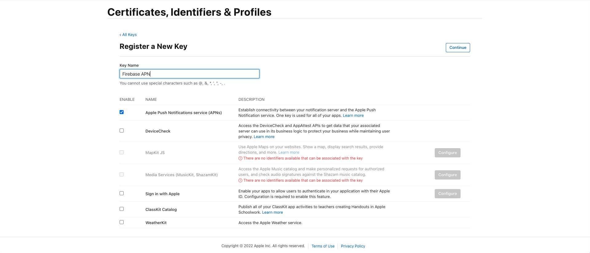
After you get the APNs' key ID, please also have your Apple team ID at hand and follow the steps to set up APNs key on the FCM console.
Steps
-
Go to FCM project settings.
-
Go to
Cloud Messagingtab.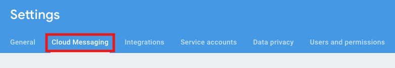
-
Go to
iOS app configurationsection and clickUploadunder the APNs Authorization Key section.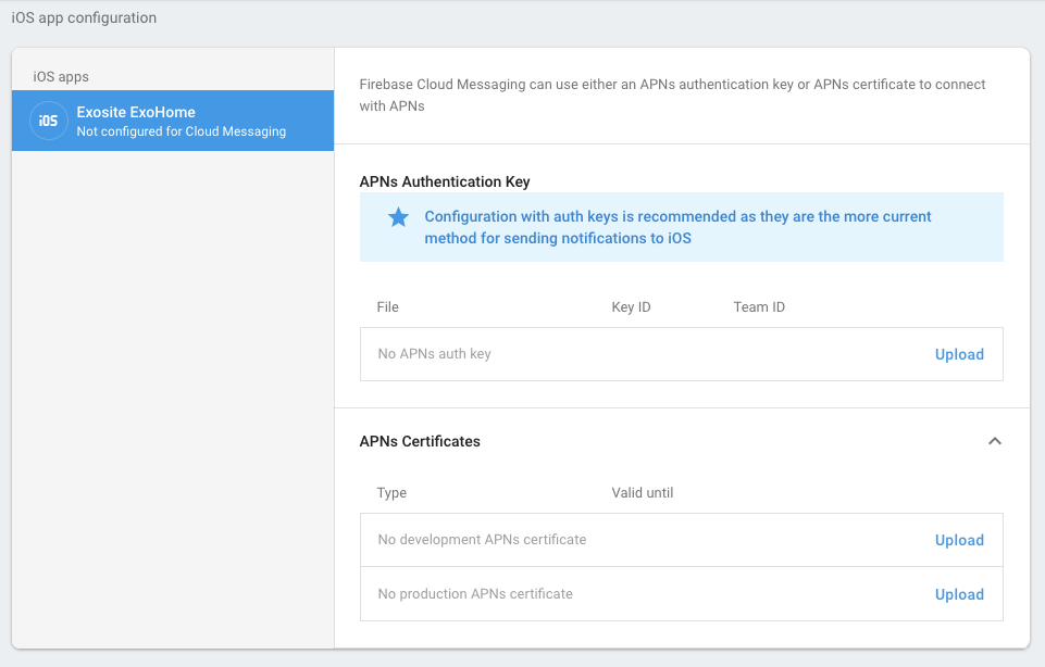
-
Choose the .p8 file and input APNs key ID, Apple team ID. Click
Uploadto complete the setting.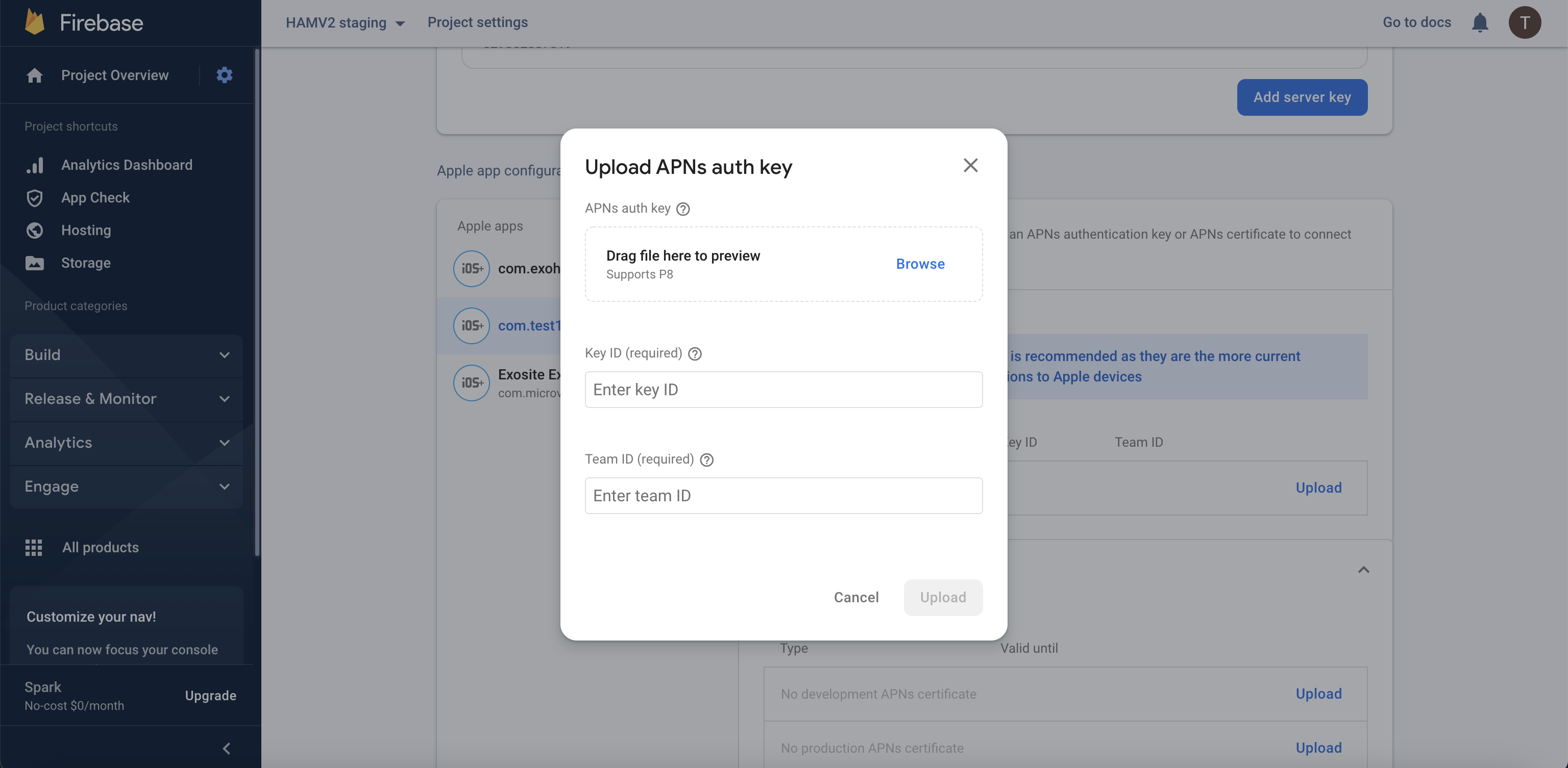
Set Up Notification on iOS
Follow these steps to prepare GoogleService-Info.plist for the FCM configuration on iOS.
Steps
-
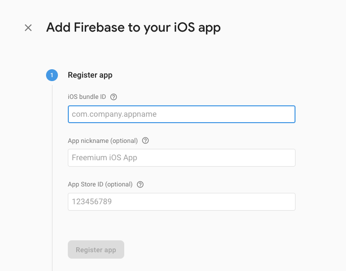
Create an iOS application on FCM console.

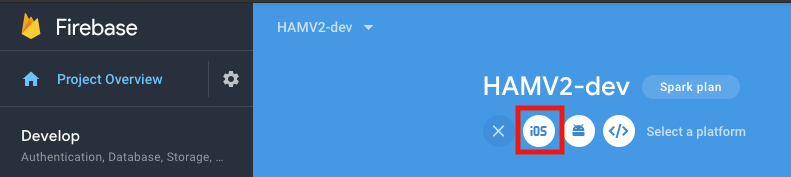
-
Fill in the information of your iOS app.
-
Download
GoogleService-Info.plist.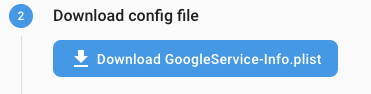
-
Click "Next" to skip the steps for native iOS app below.
- Move
GoogleService-Info.plistto Xcode project.
- Move
-
Install CocoaPods and run
pod setupto initialize it. You can skip the steps in the setting page. -
Click "Next" to skip the steps for native iOS app below.
- Add initialization code
-
Stay at the 5th step on the FCM Setting page.
Note
This step is to verify whether your application registered FCM from the client app or not. You will need to build an app to verify it.
-
Set up notification in your Ionic project to proceed with the verification process.
- Add iOS platform
ionic cordova platform add ios- Copy
GoogleService-Info.plistto Ionic project root folder. - Add the resource-file tag to the ios platform tag in
config.xml.
<platform name="ios"> <resource-file src="GoogleService-Info.plist" />platform>- Build and run your iOS App on a real device.
ionic cordova run ios --device -
Open your App and check for the installation verification status shown on the FCM setting page.
Note
If you can't pass the installation verification, please see the readme of the plugin we use to find out for more information.
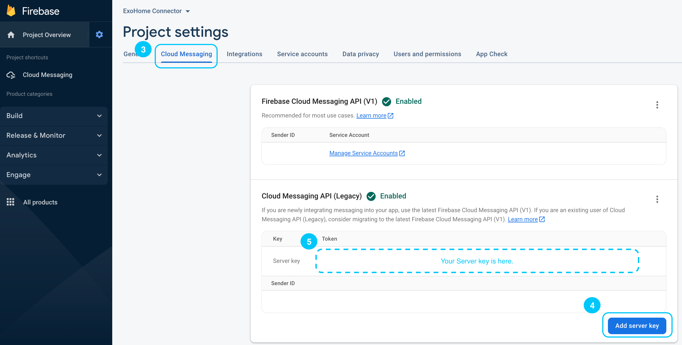
Generate Firebase Server Key
You need to provide the Firebase server key to Exosite team to complete the push notification setting.
Steps
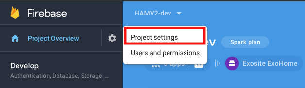
- Click the settings (cogwheel) icon at the top of the Firebase Console.
-
Choose
Project Settings.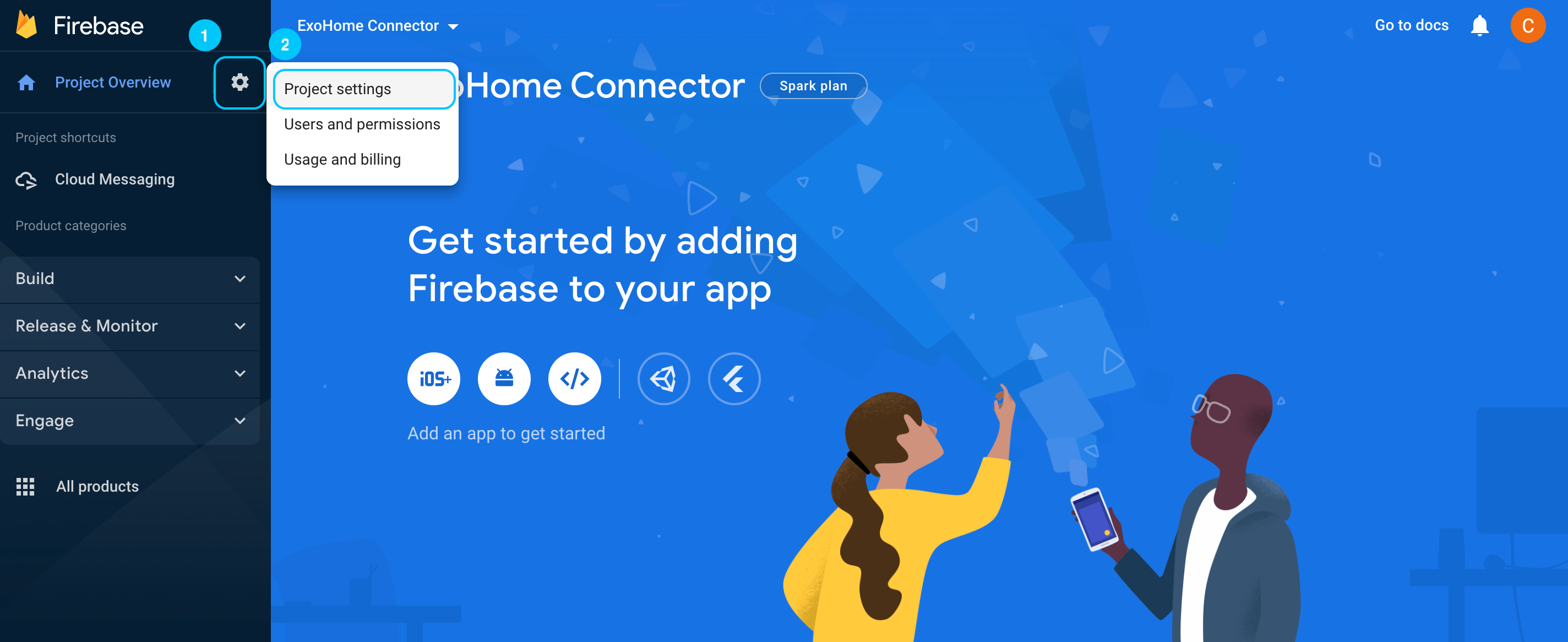
-
Click on the
Cloud Messagingtab. - Click
Add server keybutton in the lower right corner. -
A server key will be generated immediately. Copy the token and provide it to the Exosite support team.
Warning
Please copy the entire token. Do not provide any screenshot in case of unexpected errors.
Publishing Your App
Submit Your App to Google Play Store
Preparing a release Android APP bundle
The Android App Bundle is Android's new, official publishing format. Follow these steps to prepare a release APP Bundle for the Google Play Store.
Steps
-
Open your terminal and cd to the hamv_mobile
cd hamv_mobile -
Generate a release keystore
keytool -genkey -v -keystore <keystoreName>.keystore -alias <keystoreAlias> -keyalg RSA -keysize 2048 -validity <keystoreValidityTime>

-
Generate a key hash for Facebook Login
keytool -exportcert -alias <keystoreAlias> -keystore <keystoreName>.keystore | openssl sha1 -binary | openssl base64
Note
Make sure to save this file somewhere safe, if you lose it you won’t be able to submit updates to your app.
-
Put your release key hash to Facebook developer
- Go to Facebook for Developers website
- Select your app
- Go to the page Settings/Basic
https://developers.facebook.com/apps/<your APP Id>/settings/ - Find the block "Android"
- Put the key hash that you just generated into the field "Key Hashes"
- Click "Save Changes"
-
Prepare a production release config
- Copy and paste your
release.keystorefile to<project_root>/keystoresfolder. - Go back to
<project_root>folder and openbuild.json. - Add the
releaseinformation block toandroidscope. EditstorePassword,aliasandpasswordvalues.
Here is an example of a build configuration file:
{ "android": { "debug": { "keystore": "./keystores/debug.keystore", "storePassword": "android", "alias": "androiddebugkey", "password" : "android", "keystoreType": "" }, "release": { "keystore": "./keystores/release.keystore", "storePassword": "<release_keystore_password>", "alias": "<keystoreAlias>", "password" : "<release_password>", "keystoreType": "" } } } - Copy and paste your
-
Build a production release version APP Bundle by inputing the commands below:
Then, add these commands:ionic cordova build android --prod --releasecd platforms/android ./gradlew bundleRelease
After building process is done, you can find your android-release.aab under <project_root>/platforms/android/app/build/outputs/bundle/release folder.
Now you have your final release binary and you can release this to Google Play Store.
Release app to Google Play Store
Steps
-
Go to Google Play Developer Console. If you start from scratch, please register for a Google Play Developer account to create and set up your APP.
Note
If this is your first release for this app, follow the instructions to configure Play App Signing.
-
Go to your APP and click
productionon the left navigation.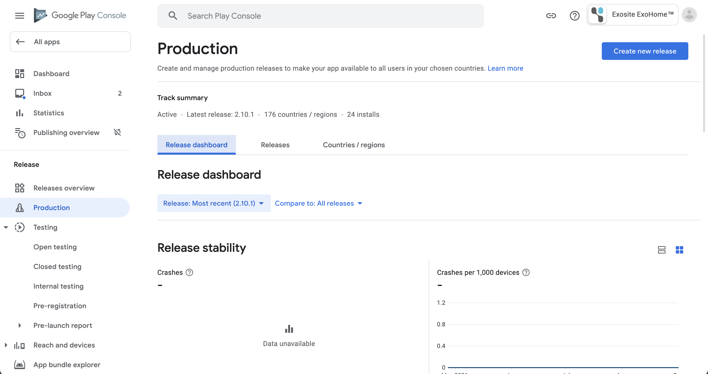
-
Click
Edit releasebutton on the upper right.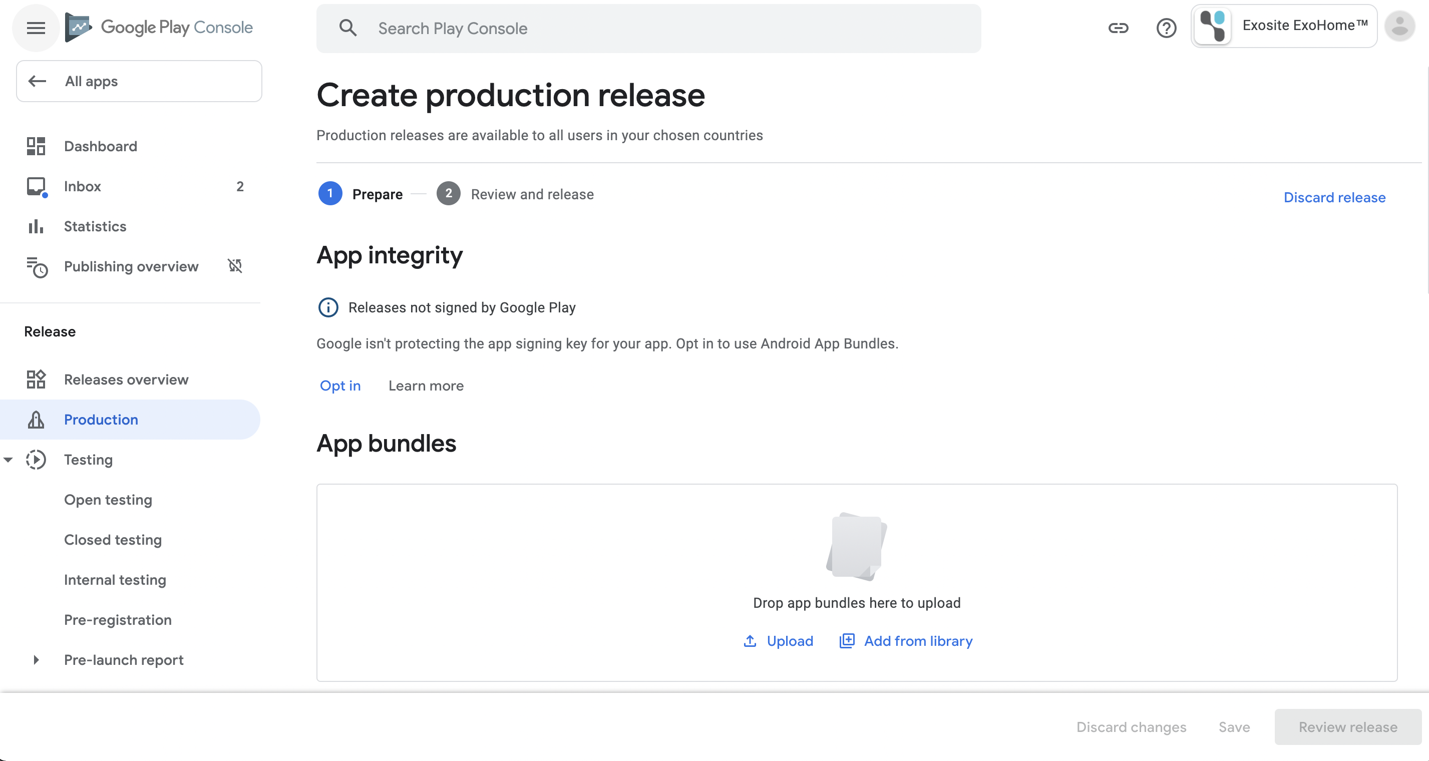
-
Upload the App Bundle file (it should be
.aabfile format) and fill in release details. - Click
Save, and thenReview releaseto check all the release information is correct. - Submit for Google Play to review. Normally it takes around 5 business days. If there is no problem of your submission, your APP will be published.
Submit your app to the App Store
Release app to the App Store
Steps
-
Go to iTunes Connect and log in
-
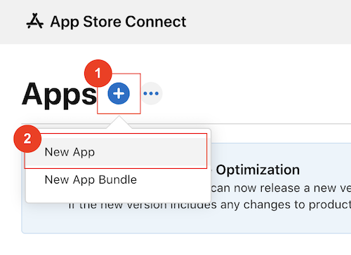
Click "My Apps"
-
Click the plus button and select "New App"
-
Fill the fields in the popup and click "Create" button
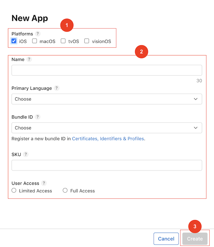
Note
If you don't have a bundle ID that can be selected, go here to create one
-
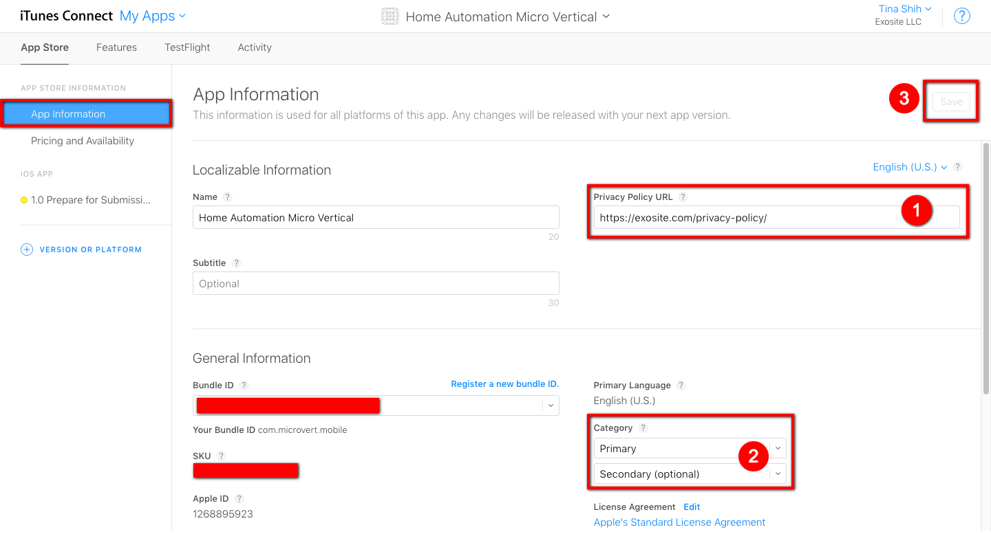
Click the app that you just created
-
Go to the "App Information" page and fill the privacy URL and select the category of your app
-
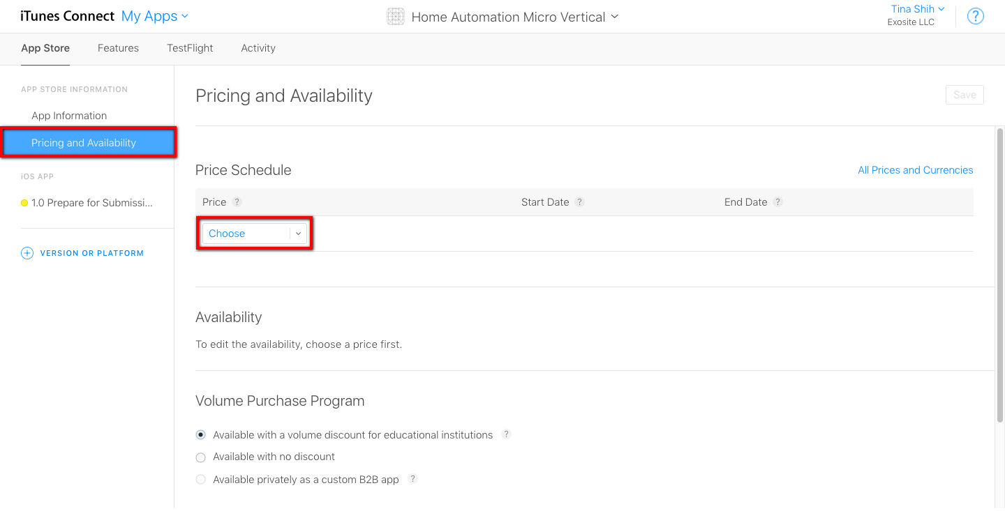
Go to "Pricing and Availability " page, select the price of your app and select an option under the "Volume Purchase Program"
-
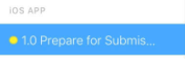
Go to "Prepare for Submission " page and fill out the field in the page
Note
The images of 5.5-inch Display (iPhone) and 12.9-inch Display (iPad) are REQUIRED
-
Please follow the section Upload build to your app to upload your build for review
-
Click button "Submit for Review" in the page "Prepare for Submission " on the top right

Upload build to your app
Steps
-
Open Xcode and select the file name extensions ".xcworkspace"
-
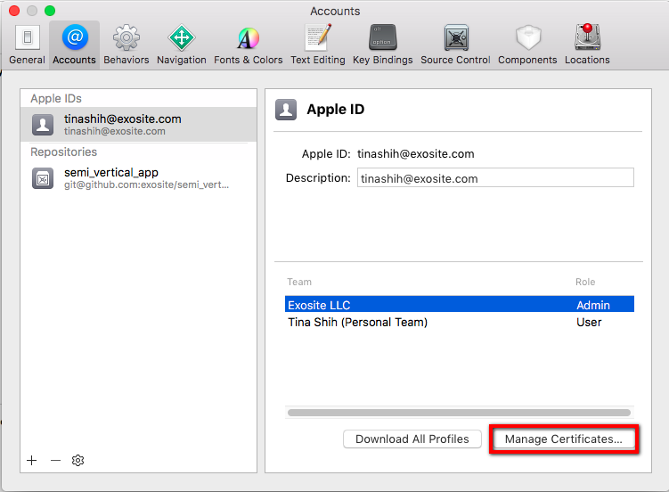
Open Preferences
(1) Select your account and click "Manage Certificates" button
(2) Create a new certificate if you don't have one
-
Click the "General" tab and select the team
-
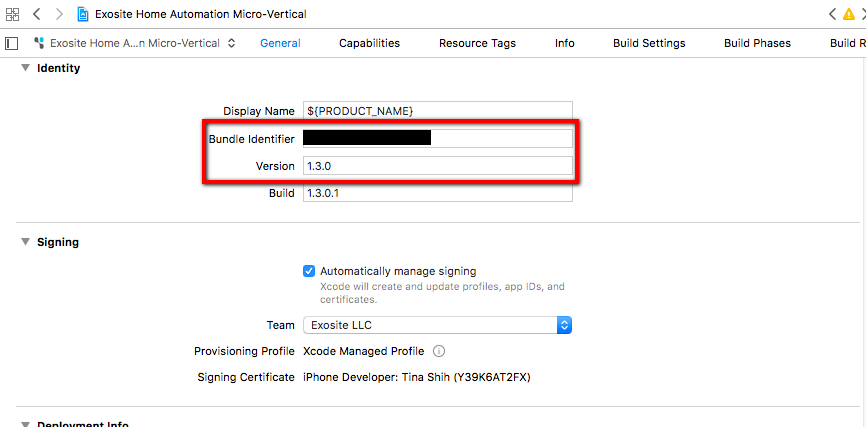
Make sure your bundle ID and version are as the same as the settings in iTunes Connect
-
Go to Resources > Images.xcassets, make sure the images of 60pt exist

-
Change the app build to Generic iOS Device

-
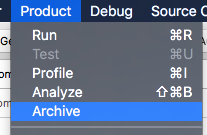
Click Product > Archive
-
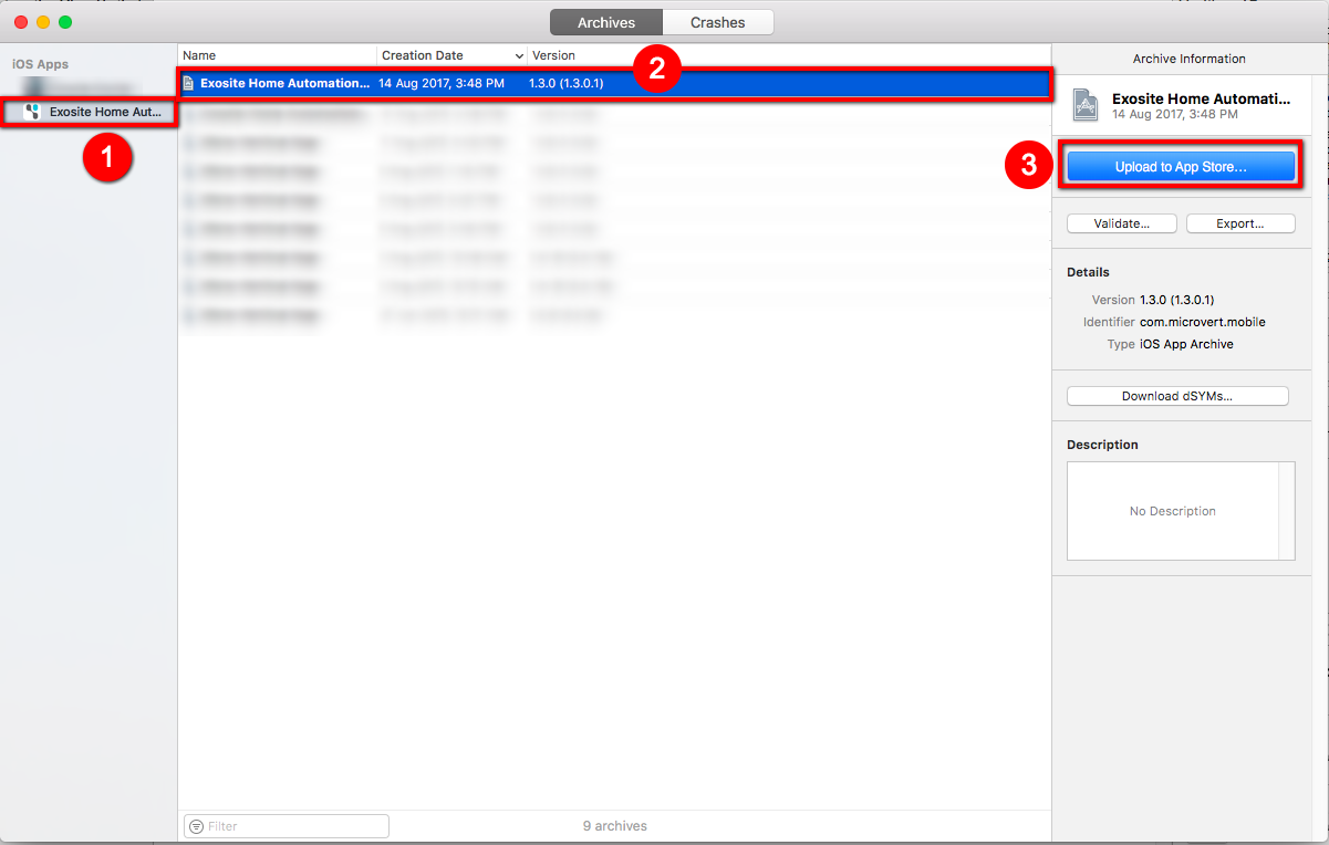
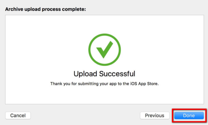
Select the archived file, and click Upload to App Store button
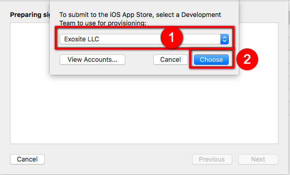
(1) Select your team and click the button Choose
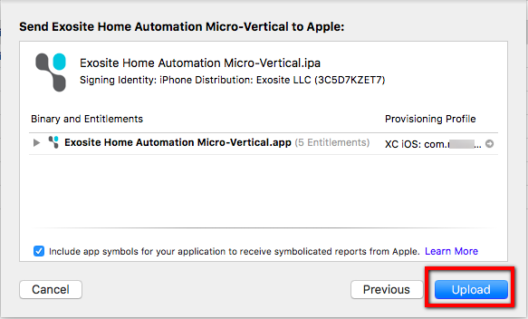
(2) Check the information and click Upload button
(3) Click the button Done after seeing Upload Successful
-
Go back to iTunes Connect, select Activity tab, check if the build that you uploaded is already there
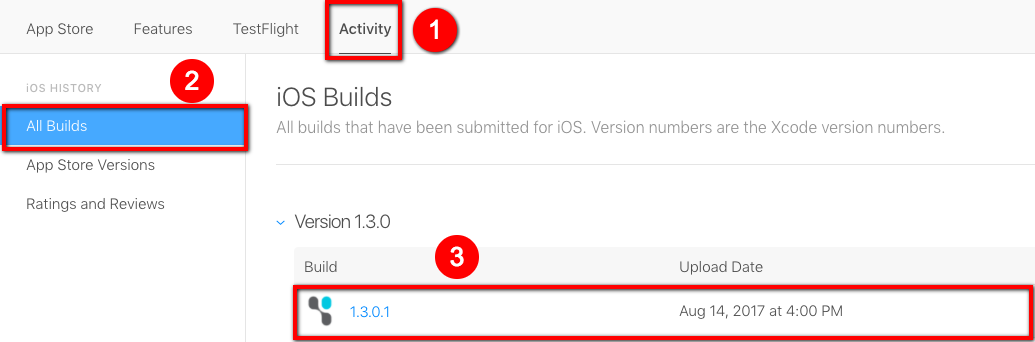
Note
If the status for the build is Processing, please wait for a while.
-
Click the tab "App Store", and click "Prepare for Submissions"

-
Upload your build file
Troubleshooting
This section is not necessary for building the App. It is mainly for debugging.
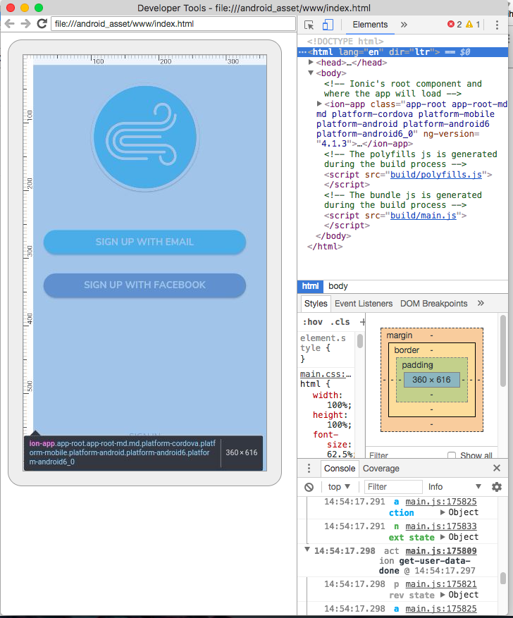
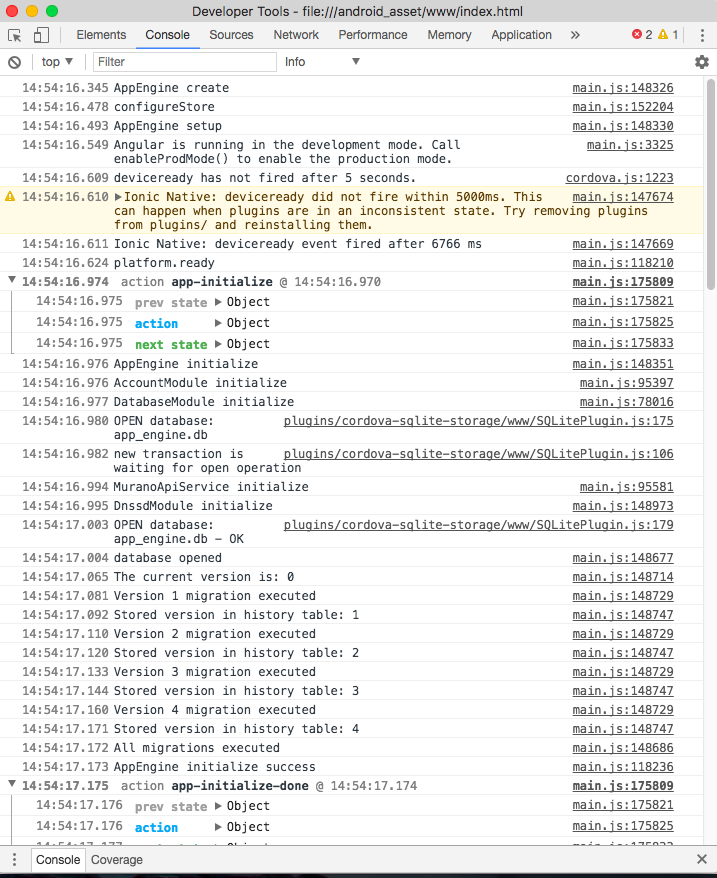
Check log on an Android phone
Steps
-
Make sure your app is built and launched on the phone successfully.
-
Open Google Chrome browser, and go to the url chrome://inspect
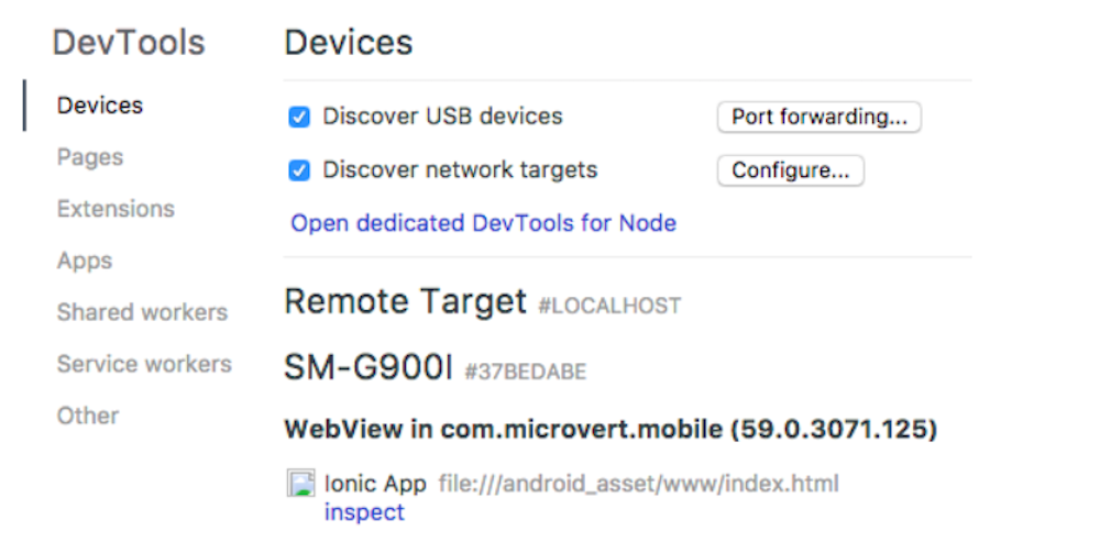
-
Click inspect
-
You can see the App logs now.
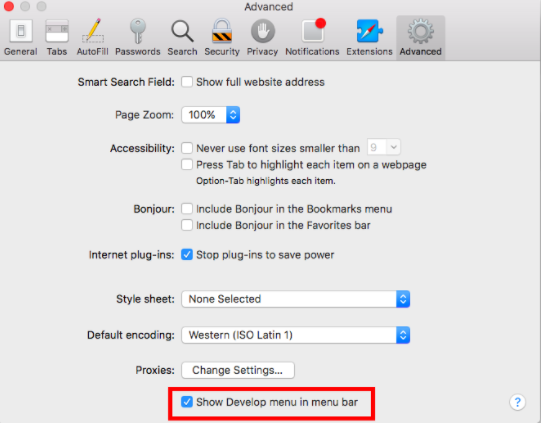
Check log on an iOS phone
Steps
-
Turn on “Show Develop menu in menu bar" in Safari’s preferences.
-
Make sure your App is built and launched successfully.
-
Open your App on the phone
-
Open the Safari browser
-
Click Develop > iPhone > <Your App>
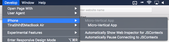
-
You can see the logs now.
Congratulations!
You’ve completed all the articles in this section. For questions and more information on the ExoHome™, visit our support site.
App Config
Several app-based settings can be managed in the "app.config.ts" file, which is under hamv_mobile/src/app/.
Details
Steps
- appEngine: This field is used to set up the cloud services.
- solutionHost: (Required) The solution the app connects to for cloud services.
- productHost: (Required) This is MQTT service host that would be sent to device when provsioning.
- hockeyApp: The HockeyApp account keys used to distribute apps via HockeyApp. For more information, see HockeyApp.
- mixpanel: The Mixpanel token used to track user behavior data to Mixpanel. For more information, see Mixpanel
- group: (Required) Used to set UI limits for groups.
- max: The maximum limit for the number of groups your users can add.
- devices: The maximumlimit for the number of devices your users can have in a group. If user exceeds this limit, an alert pop up will be shown on the app and the action will be reverted.
- schedule: (Required) Used to set UI limits for schedules.
- max: Modify the maximum limit for the number of schedules your user can have per device.
-
theme: Used to set up the general app theme.
Note
Your Admin site Theme settings will overwrite the values set here.
- color: Change the primary color of your app.
- productName: Change the product name of your app.
- wifiName: Represents the Wi-Fi name shown under the "Add Device" page.
-
support: Used to set up customer support settings.
- email: The support email address used for end-users to send feedback.
- disableLog: Used to enable/disable the end-user feedback and logging feature.
-
logConfig: Used to set up the end-user feedback and logging feature.
- recordLimit: The number of debug logs the app will store. The recommended setting of 10,000 is to ensure a smaller file size for the end-user.
Note
If you want to publish your mobile App, please disable this logging feature.
-
amazonAlexa: Used to set up the Amazon Echo page.
- skillName: Represents the Amazon Alexa skill name shown under the "Amazon Echo" page.
- googleHome: Used to set up the Google Home page.
- ghName: Represents the Google Home action name shown under the "Google Home" page.
For questions and more information on the ExoHome™, visit our support site.
Have more questions? Submit a request